Plots
R’s visualization capabilities are one of its greatest strengths, and webRoid brings them fully to Android. Whenever your R code produces a graphic (whether from the Console or the Editor), the app captures it automatically and adds it to the Plots gallery. You do not need to call dev.off() or save anything manually.
Generating Plots
Any R code that produces graphical output will create a plot in webRoid. This includes base R graphics, ggplot2, lattice, and any other package that uses the standard R graphics device:
# Base R
plot(1:10, sin(1:10), type = "l", main = "Sine Wave")
hist(rnorm(100), main = "Normal Distribution")
boxplot(mpg ~ cyl, data = mtcars)

# ggplot2 (after installing the package)
library(ggplot2)
ggplot(mtcars, aes(wt, mpg)) + geom_point()
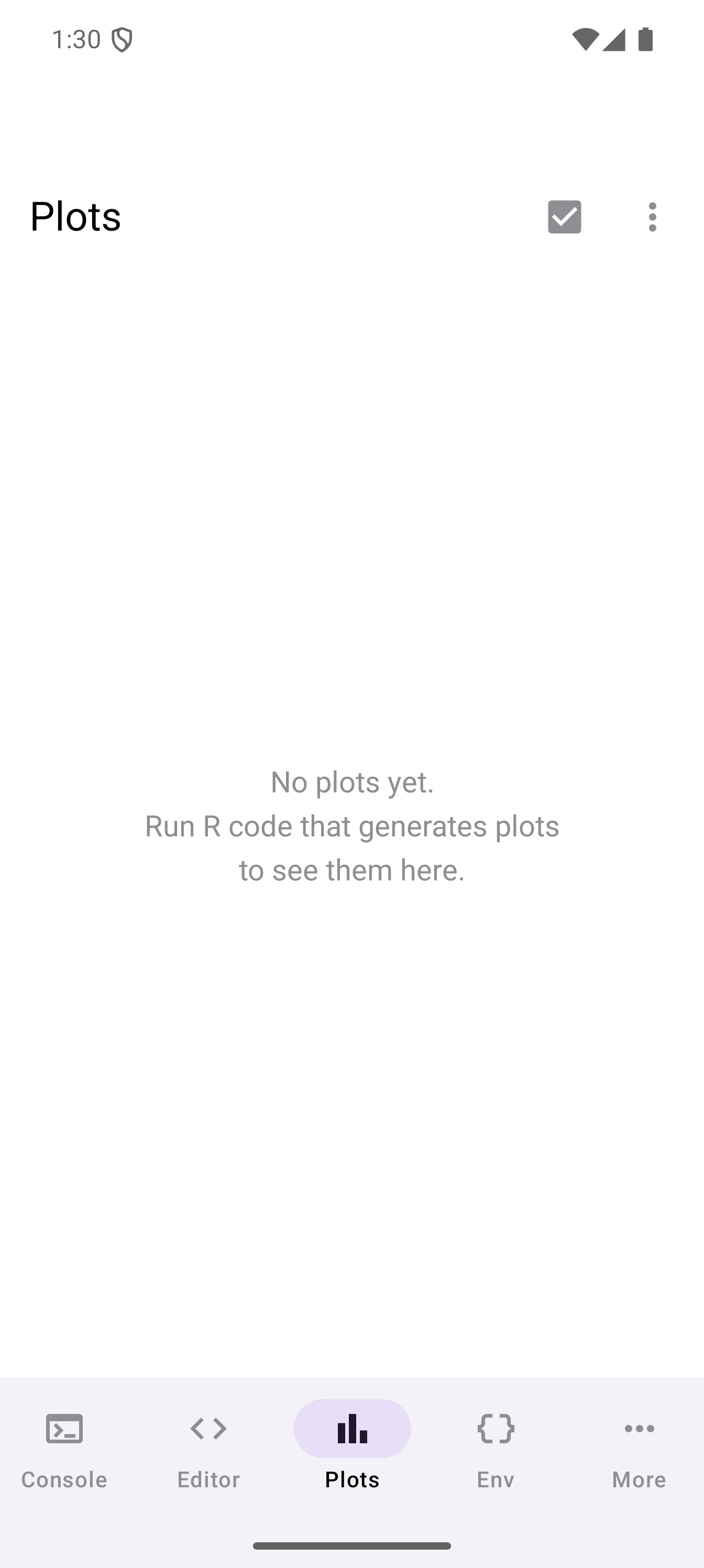
Run the code from the Console or the Editor and the resulting plot appears in the Plots tab. Before any plots have been generated, the gallery shows an empty state with a prompt to get started.
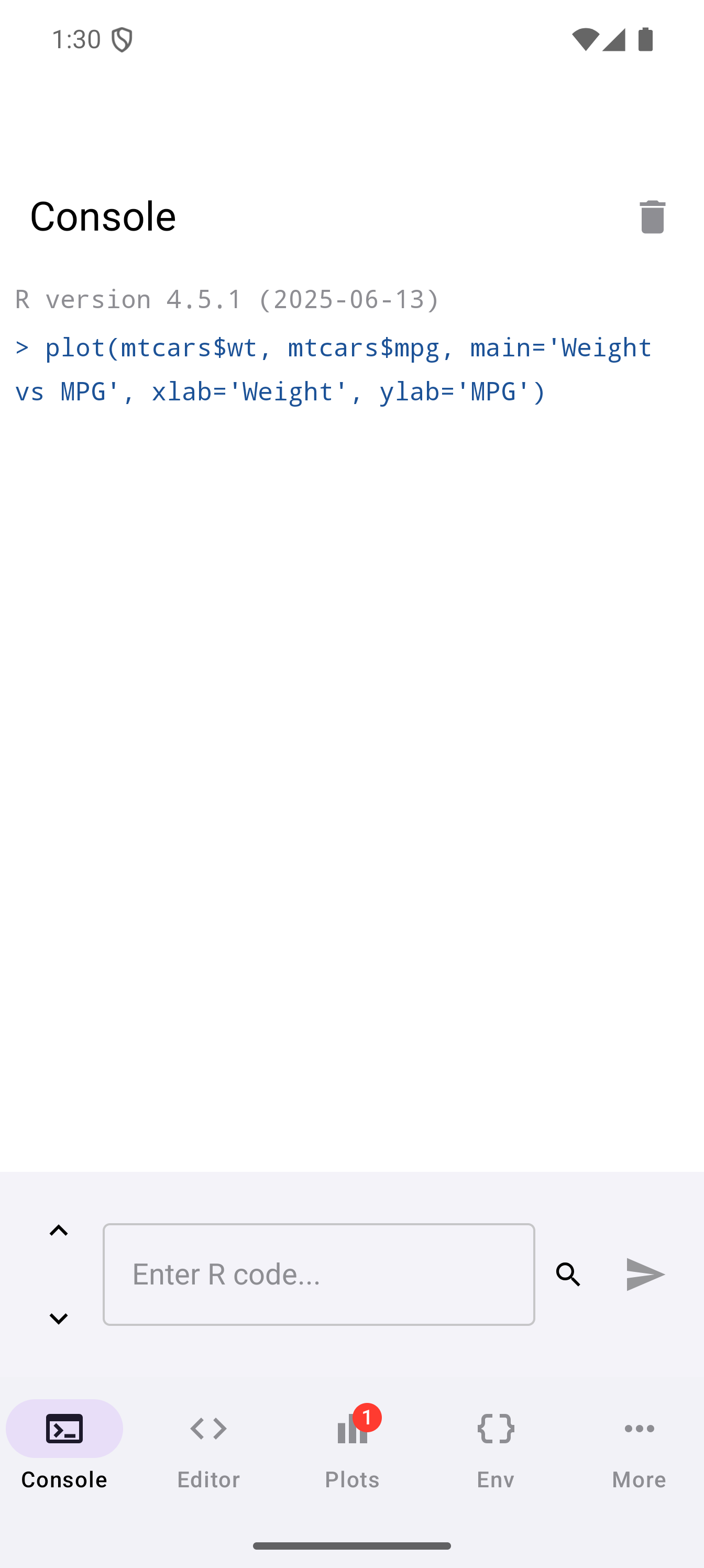
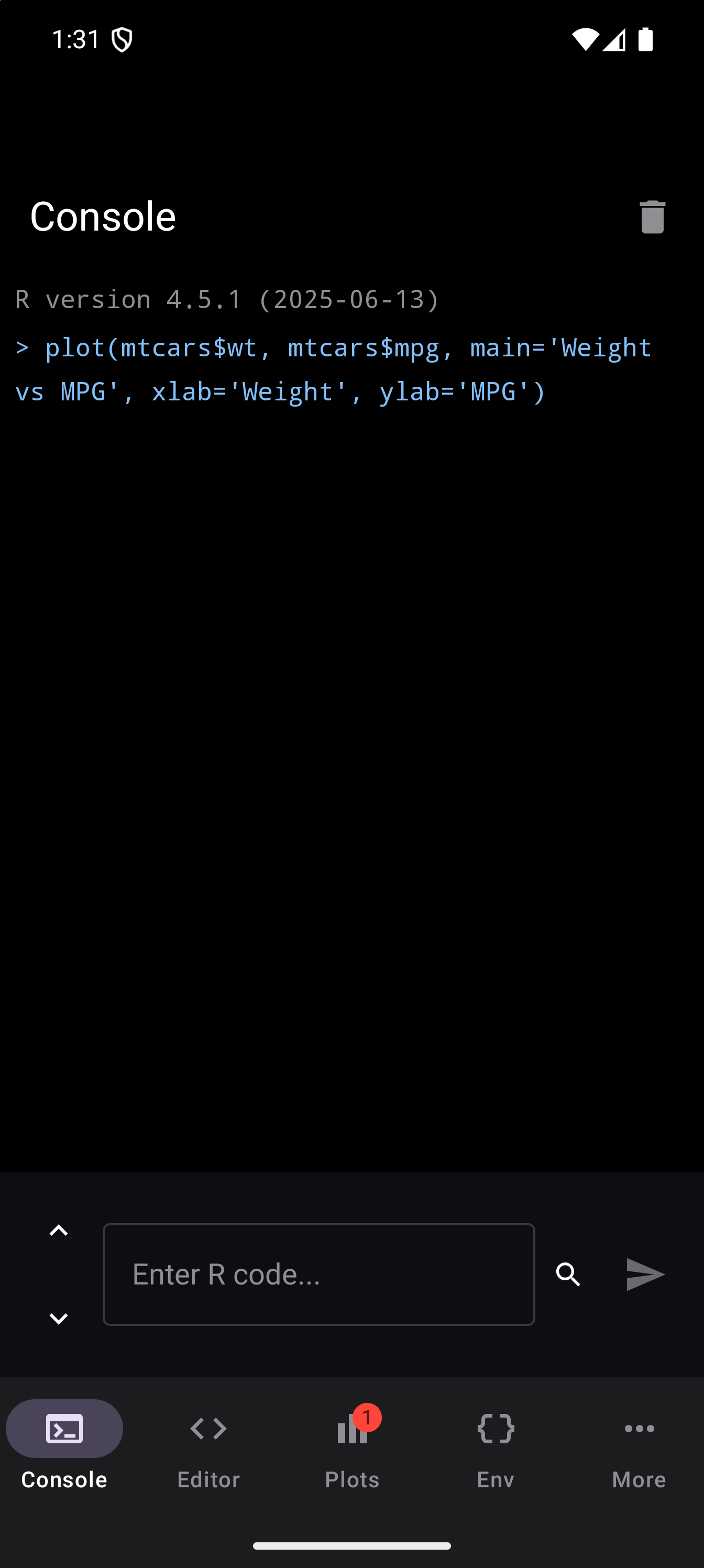
When new plots are generated, a badge appears on the Plots tab icon in the bottom navigation bar showing how many unseen plots are waiting. The badge clears once you visit the Plots tab.
Interactive Plots
Alongside static graphics, webRoid captures interactive plots produced by htmlwidgets-based R packages. The widget is written out as a single self-contained HTML document with every piece of its JavaScript and CSS inlined, so it renders in a WebView with no network access and keeps its interactivity: you can search, sort, page, hover, and zoom the same way you would on the desktop.
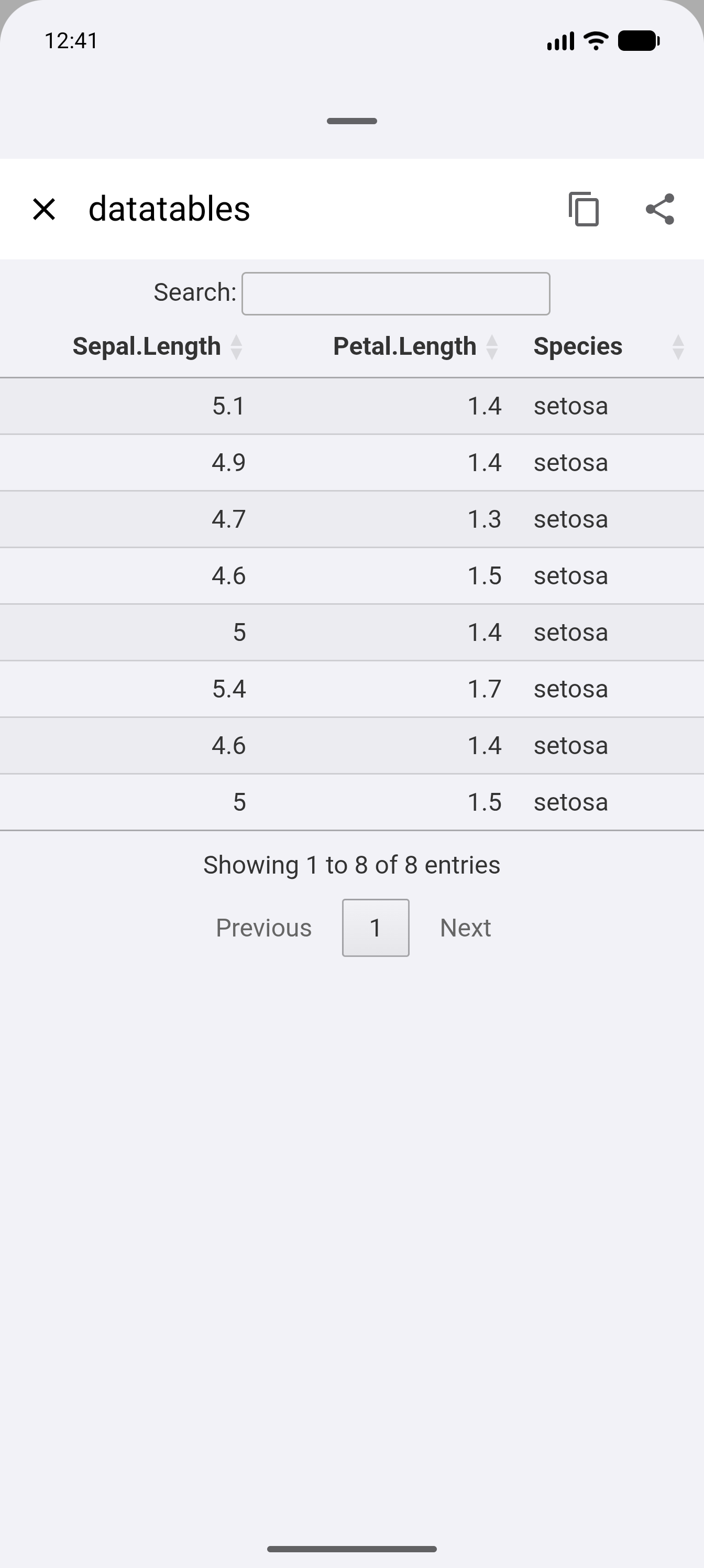
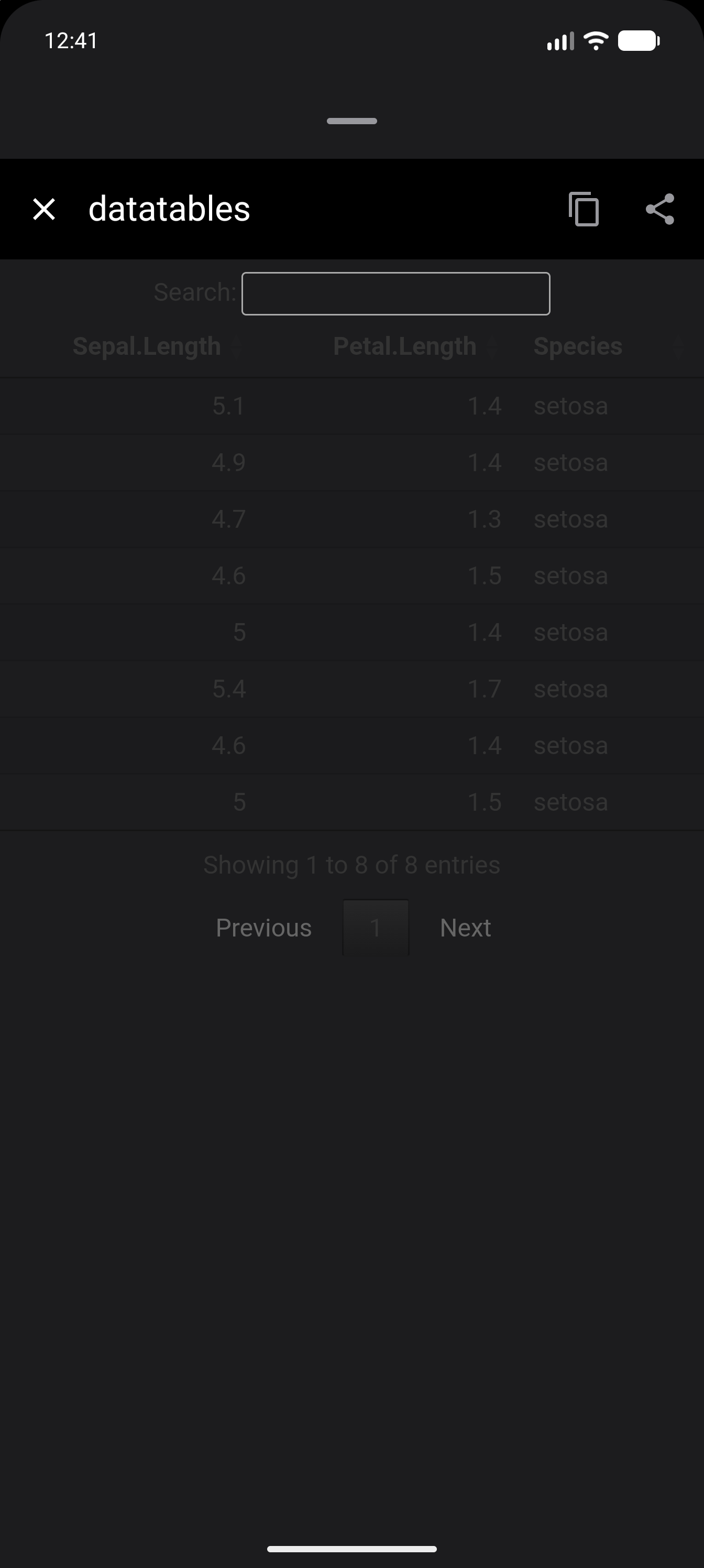
The table above was made with the DT package. It shows the first eight rows of R’s built-in iris data, keeps three of its columns and leaves out the row numbers, so it fits across a phone screen. The dom = "ftip" option keeps the search box, the table, the line that counts the rows and the page buttons, and leaves out the menu for choosing how many rows to show. pageLength = 8 puts all eight rows on one page:
library(DT)
datatable(
  head(iris[, c("Sepal.Length", "Petal.Length", "Species")], 8),
  rownames = FALSE,
  options = list(dom = "ftip", pageLength = 8)
)
To make it yourself, install the packages first (see Installing what you need). Then paste the code into a new script in the Editor and tap Run. The table appears in the Plots tab, under Interactive. The plotly and leaflet examples below work the same way. Each example ends with the widget itself, and that matters: from the Editor in the Tab Bar and Sidebar layouts, webRoid only picks up a widget when it is the value your code finishes with (see What gets captured).
Three widget packages are verified rendering on device. A plotly figure keeps its full modebar, the strip of small buttons at its top right, so you can zoom, pan and download the plot as a PNG:
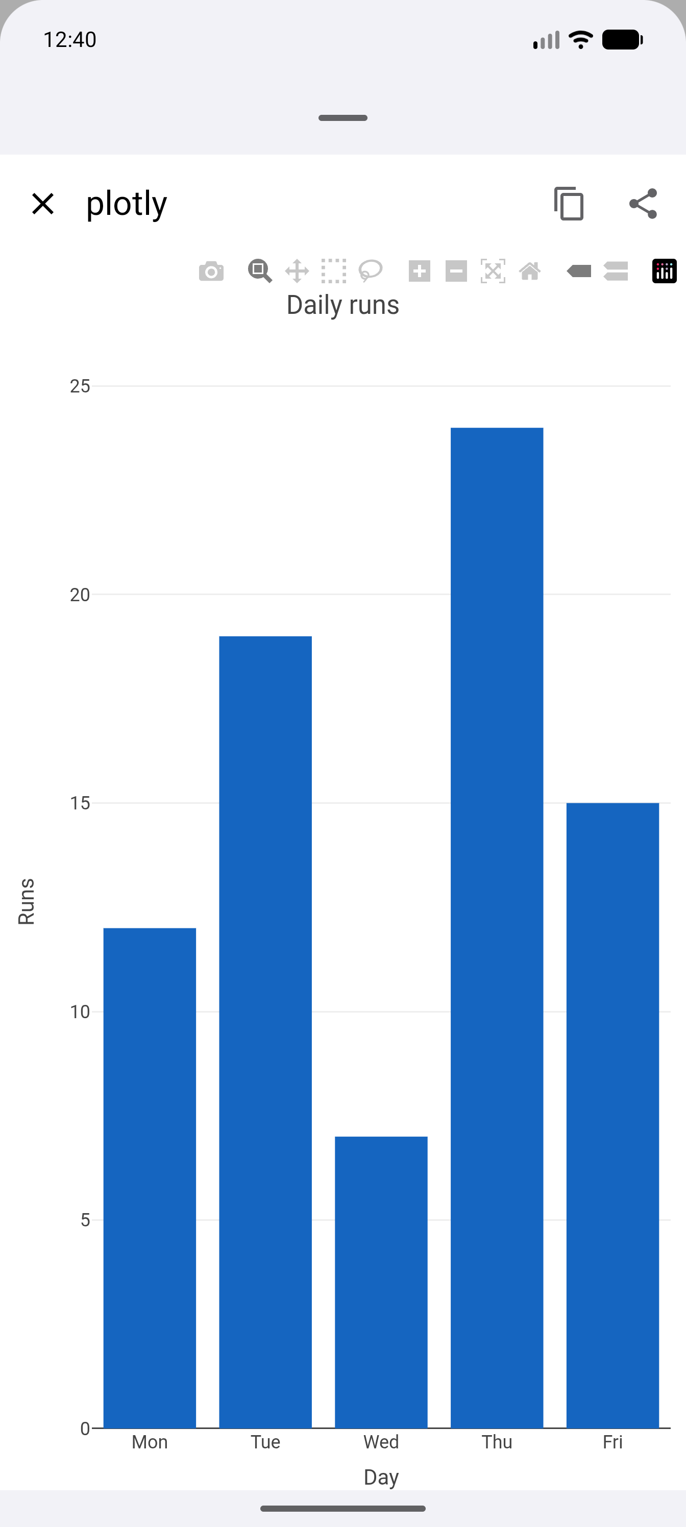
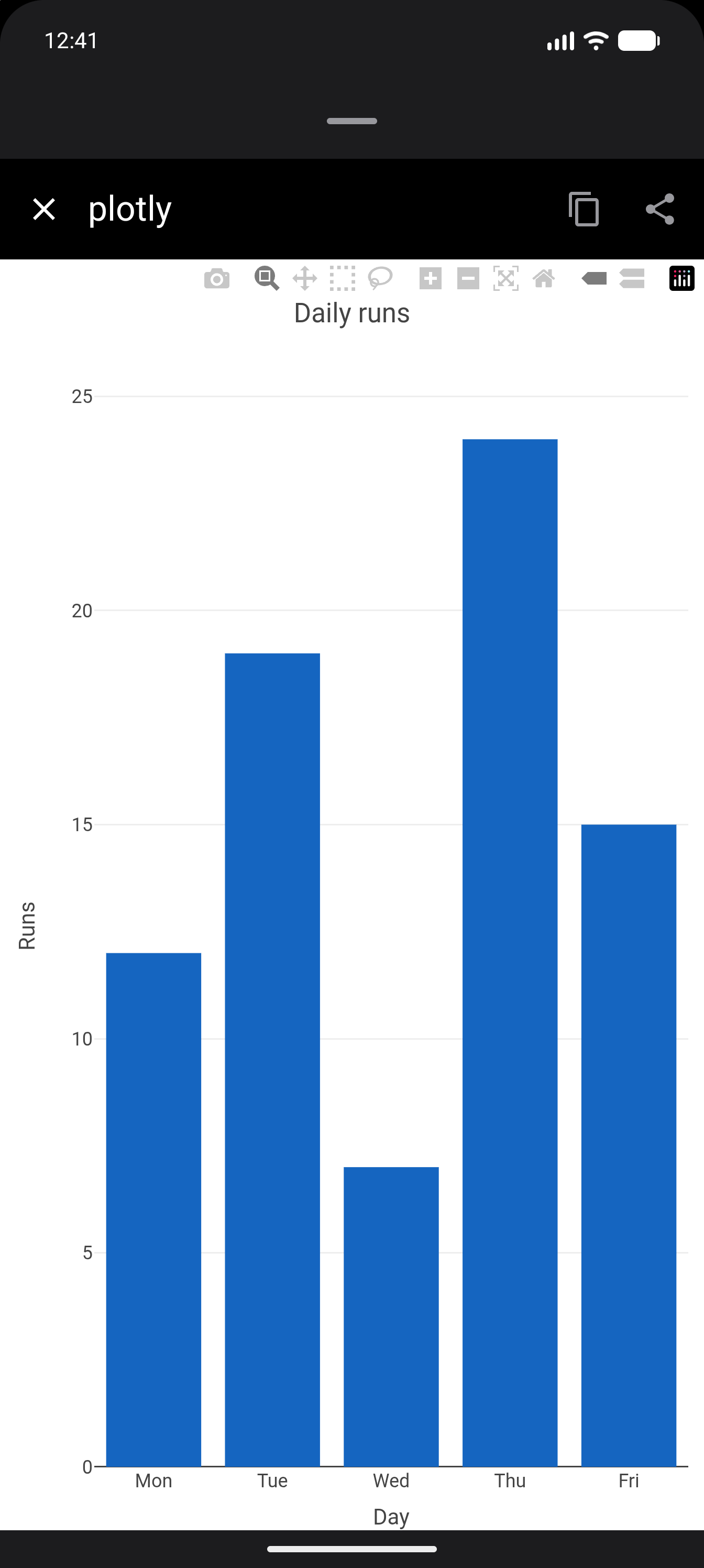
This is the code behind that chart. Setting categoryorder keeps the days in week order, since plotly would otherwise sort them alphabetically, and the larger top margin keeps the title clear of those buttons:
library(plotly)
plot_ly(
  x = c("Mon", "Tue", "Wed", "Thu", "Fri"),
  y = c(12, 19, 7, 24, 15),
  type = "bar",
  marker = list(color = "#1565C0")
) |>
  layout(
    title = "Daily runs",
    margin = list(t = 80),
    xaxis = list(
      title = "Day",
      categoryorder = "array",
      categoryarray = c("Mon", "Tue", "Wed", "Thu", "Fri")
    ),
    yaxis = list(title = "Runs")
  )
A leaflet map draws its shapes, labels, zoom buttons and scale bar:
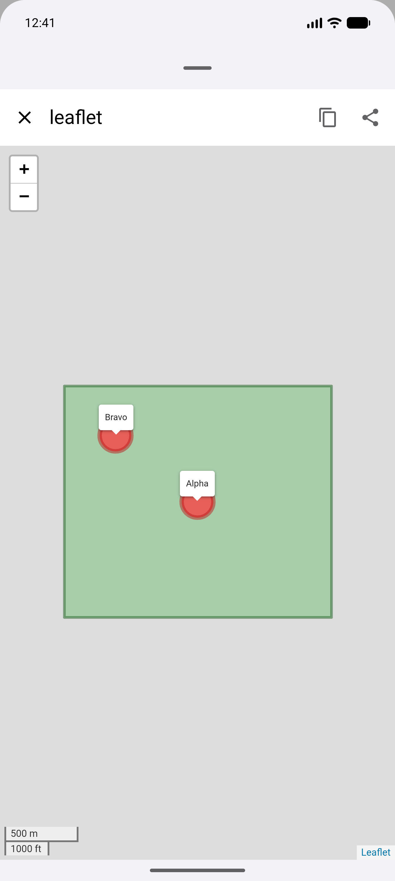
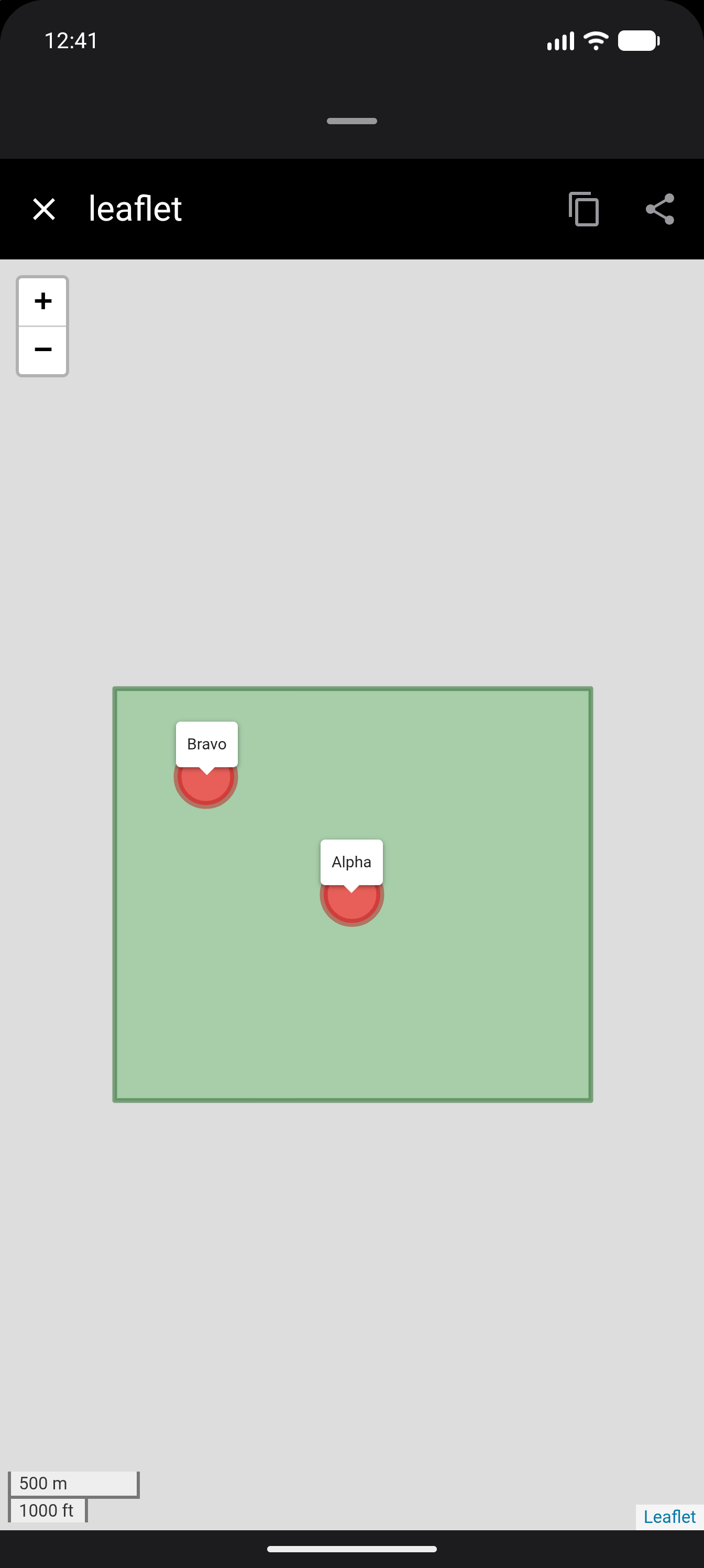
This is the code behind that map. It leaves out the background street map that addTiles() would add, so nothing is downloaded and the map draws without an internet connection. The rectangle, the two circles and their labels all come from the code itself:
library(leaflet)
leaflet() |>
  setView(lng = -0.09, lat = 51.505, zoom = 14) |>
  addRectangles(
    lng1 = -0.103, lat1 = 51.498, lng2 = -0.077, lat2 = 51.512,
    color = "#1B5E20", fillColor = "#66BB6A", fillOpacity = 0.45, weight = 3
  ) |>
  addCircleMarkers(
    lng = c(-0.09, -0.098), lat = c(51.505, 51.509),
    radius = 18, color = "#B71C1C", fillColor = "#EF5350", fillOpacity = 0.9,
    label = c("Alpha", "Bravo"),
    labelOptions = labelOptions(noHide = TRUE, direction = "top")
  ) |>
  addScaleBar(position = "bottomleft")
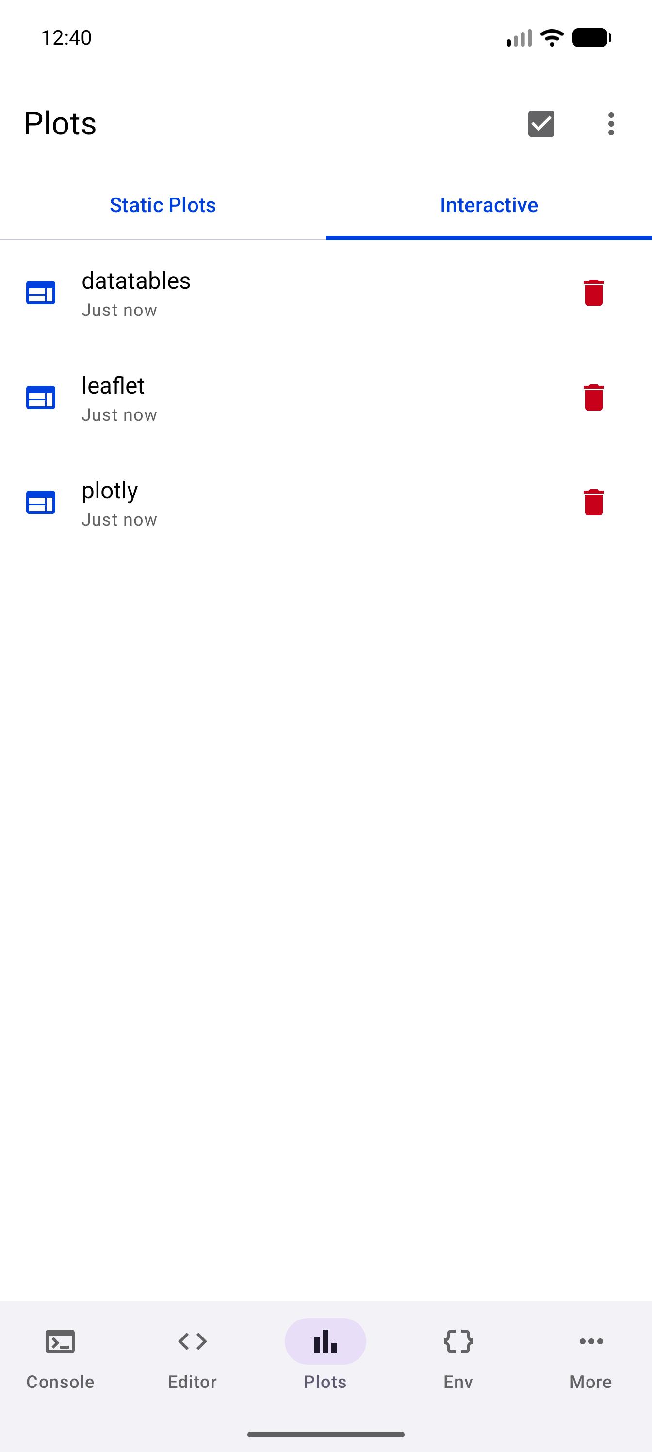
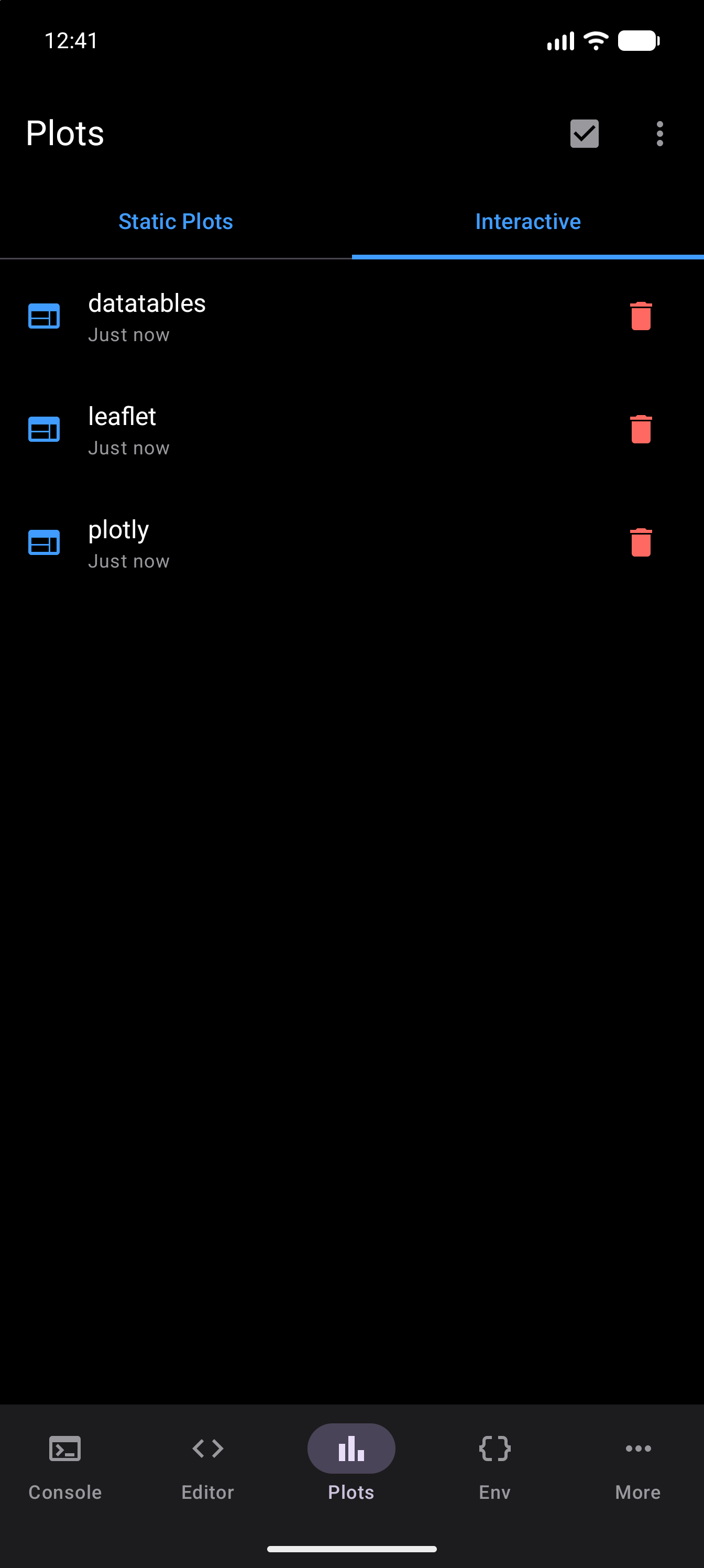
Every widget you produce is listed under Plots > Interactive, newest first:
Installing what you need
A widget package on its own is not enough. You also need htmltools and htmlwidgets, which do the work of serialising the widget into HTML. The quickest route is the Interactive Plots bundle on the Packages screen, which installs htmltools, htmlwidgets, plotly, leaflet, and DT in one action. To do it by hand:
install.packages(c("htmltools", "htmlwidgets", "DT"))
library(DT)
datatable(head(iris))
What gets captured
Only a visible, top-level value is captured. webRoid looks at the result of the command you ran. If that result is a widget and it would have printed, it goes to the Interactive tab. Anything else is missed:
print(leaflet()): printing returns the widget invisibly, so nothing is captured. Writeleaflet()instead.invisible(datatable(head(iris))): explicitly invisible, so nothing is captured.- A widget built inside a
forloop or inside a function that does not return it: only the top-level value counts, so nothing is captured.
When you run several commands at once in the Console, or from the Workspace’s Editor pane, each command that ends in a widget is picked up. From the Editor in the Tab Bar and Sidebar layouts, only the last one is.
Return one widget per command and it will be picked up.
Package coverage
The DT package is verified end to end on device: install, render, and interact. Even a small table, such as DT::datatable(head(iris)), makes a self-contained document of a few hundred kilobytes, because the code that draws the table comes along with it. It opens as a live table you can search, sort and page through.
The leaflet and plotly packages are both verified rendering on device: leaflet draws its vector layers, zoom controls and scale bar, with the sprites its stylesheet references embedded as data URIs rather than left as broken links; plotly draws its SVG traces, axes and full modebar. Other htmlwidgets packages, such as dygraphs and visNetwork, go through the same mechanism and may well work, but they have not been tested.
Viewing interactive plots
Interactive plots appear under a separate Interactive tab within the Plots screen, which only shows up once your session has produced one. The gallery lists each interactive plot by title and timestamp. Tap an entry to open it in a full-screen bottom sheet where you can interact with the visualization, copy the underlying HTML, or share it as an HTML file.
A self-contained widget document is large by nature, since every dependency is embedded rather than fetched. Complex widgets with heavy JavaScript may take a moment to render in the WebView. Pinch-to-zoom is supported within the WebView for fine control.
A widget is shown with its links locked down. Tapping an email (mailto:) or phone (tel:) link in it opens your mail or phone app, as a browser would. Every other link, whether to a web page, a file or another app, does nothing. A widget cannot read your storage folder, or files shared to webRoid, either.
Plot Gallery
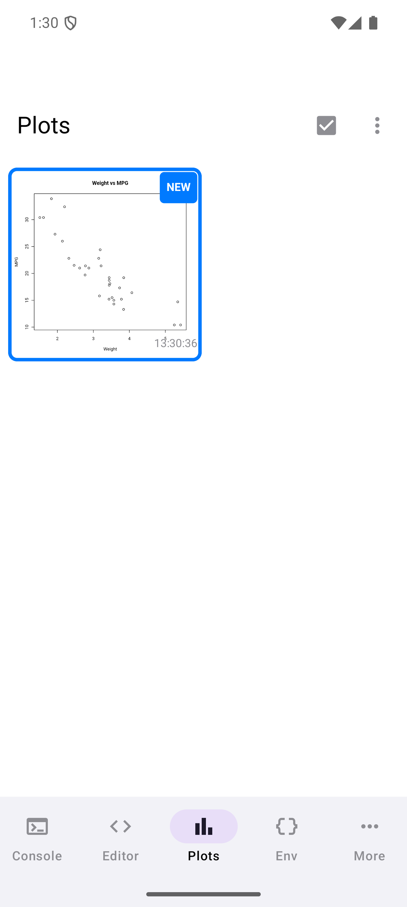
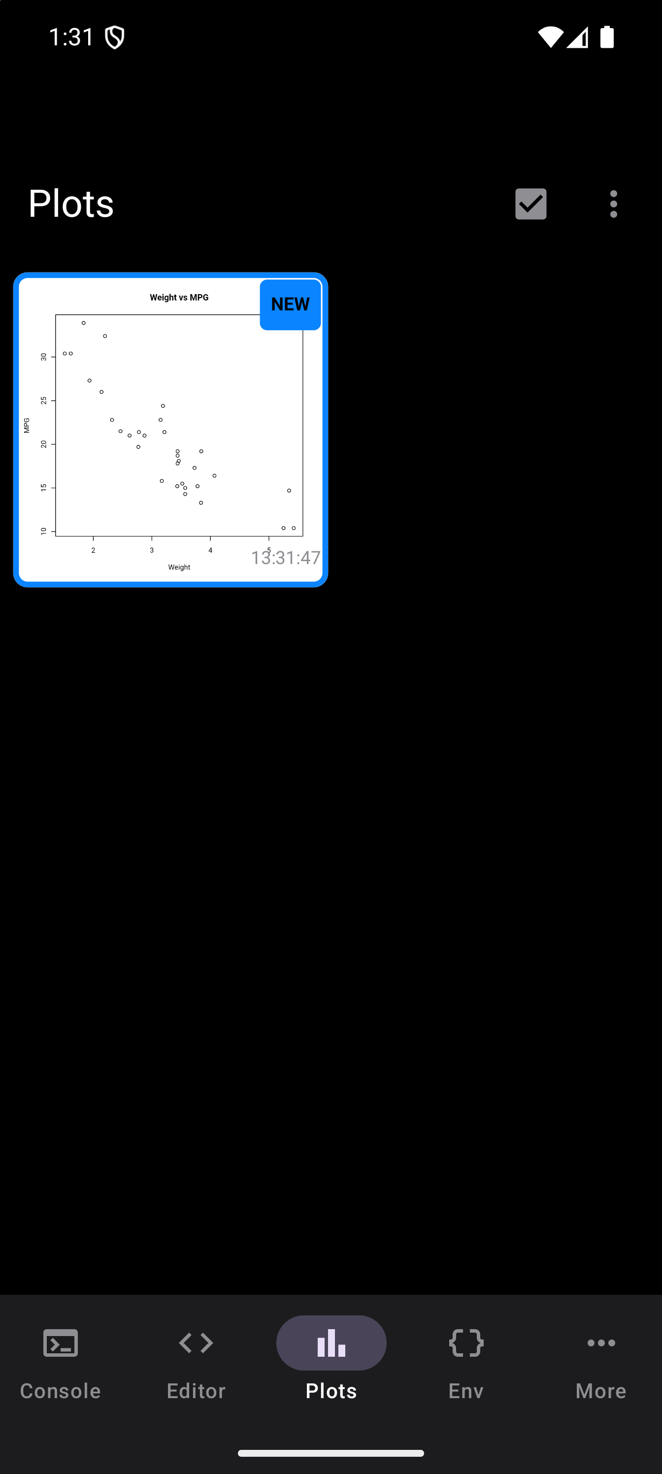
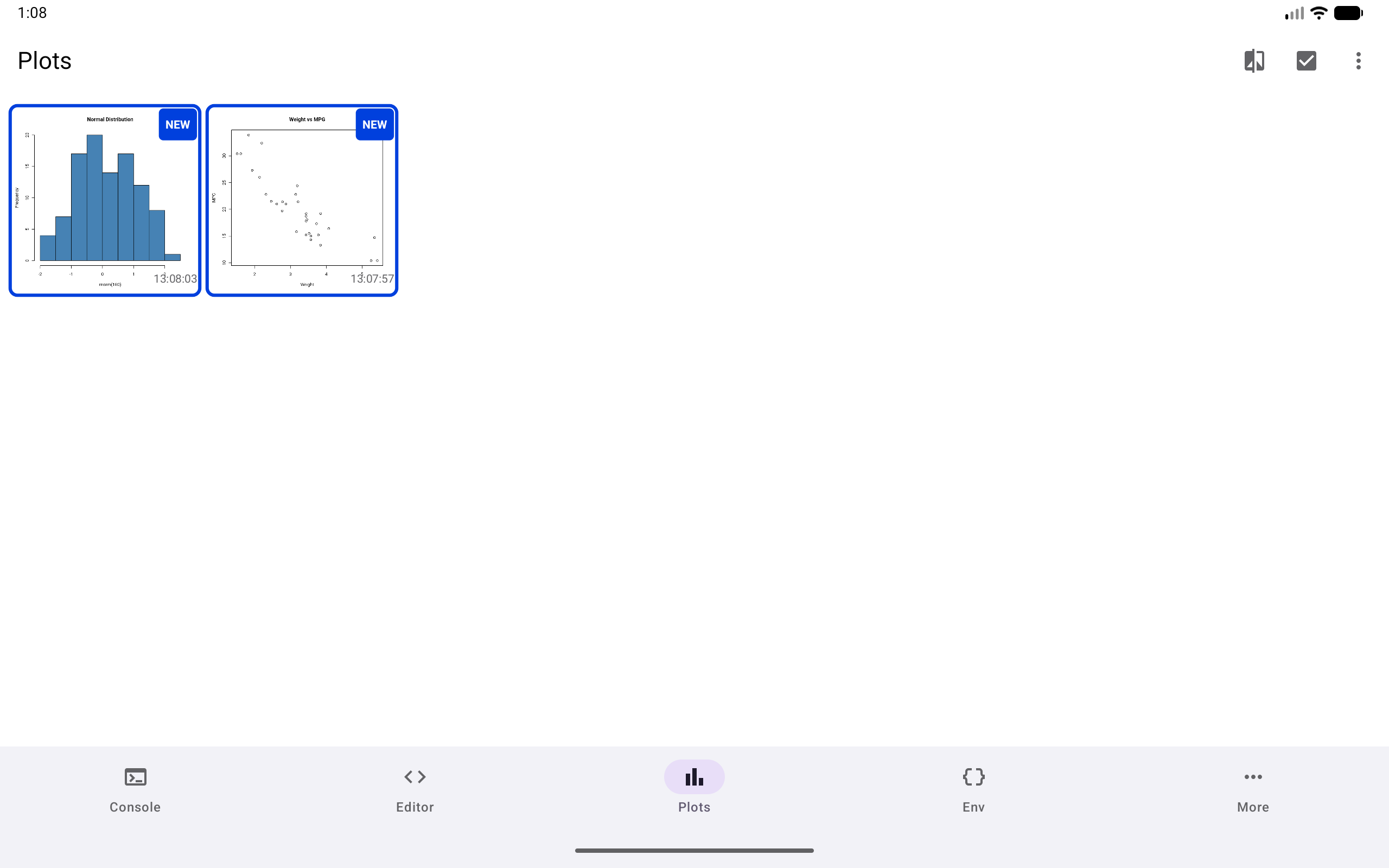
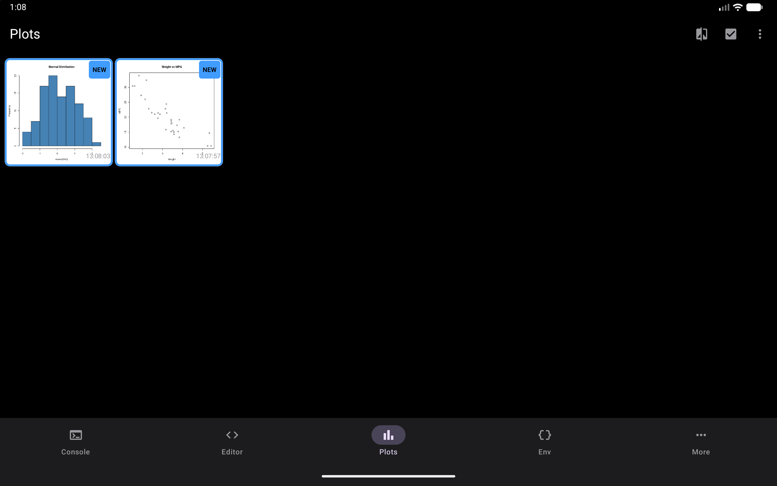
The Plots tab displays all your captured plots as a scrollable grid of thumbnails. The grid adapts to your screen size, showing more columns on wider screens and fewer on phones in portrait. Each thumbnail shows a miniature preview of the plot with its creation timestamp underneath.
When you first open the Plots tab after generating new plots, the new thumbnails briefly highlight with an animation so you can spot them quickly.
The toolbar at the top has three buttons:
- Compare starts comparison mode. It shows once you have two or more plots. See Comparing Plots.
- Select, the checkbox icon, lets you tick several plots and delete them together.
- More, the three-dot menu, holds Clear All Plots, for clearing the gallery in one go.
After you tap Select, tap each plot you want to remove. A ticked plot gets a check mark and a blue outline, and the plots you have not ticked look faded. The trash can in the toolbar then deletes the ticked plots straight away, and Done leaves selection mode without deleting anything. A pinned plot is kept even if you tick it.
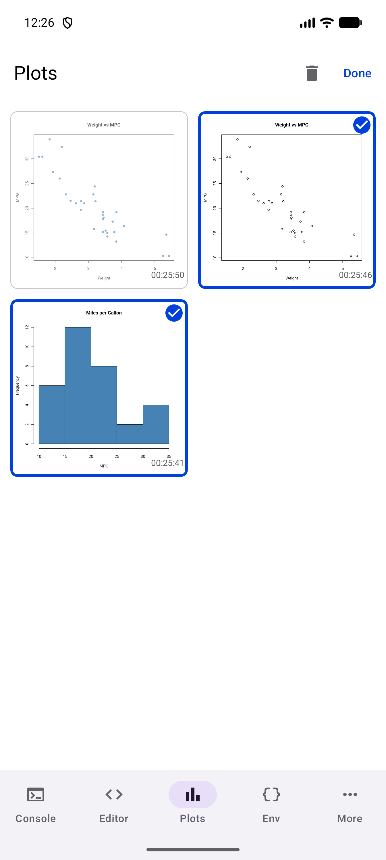
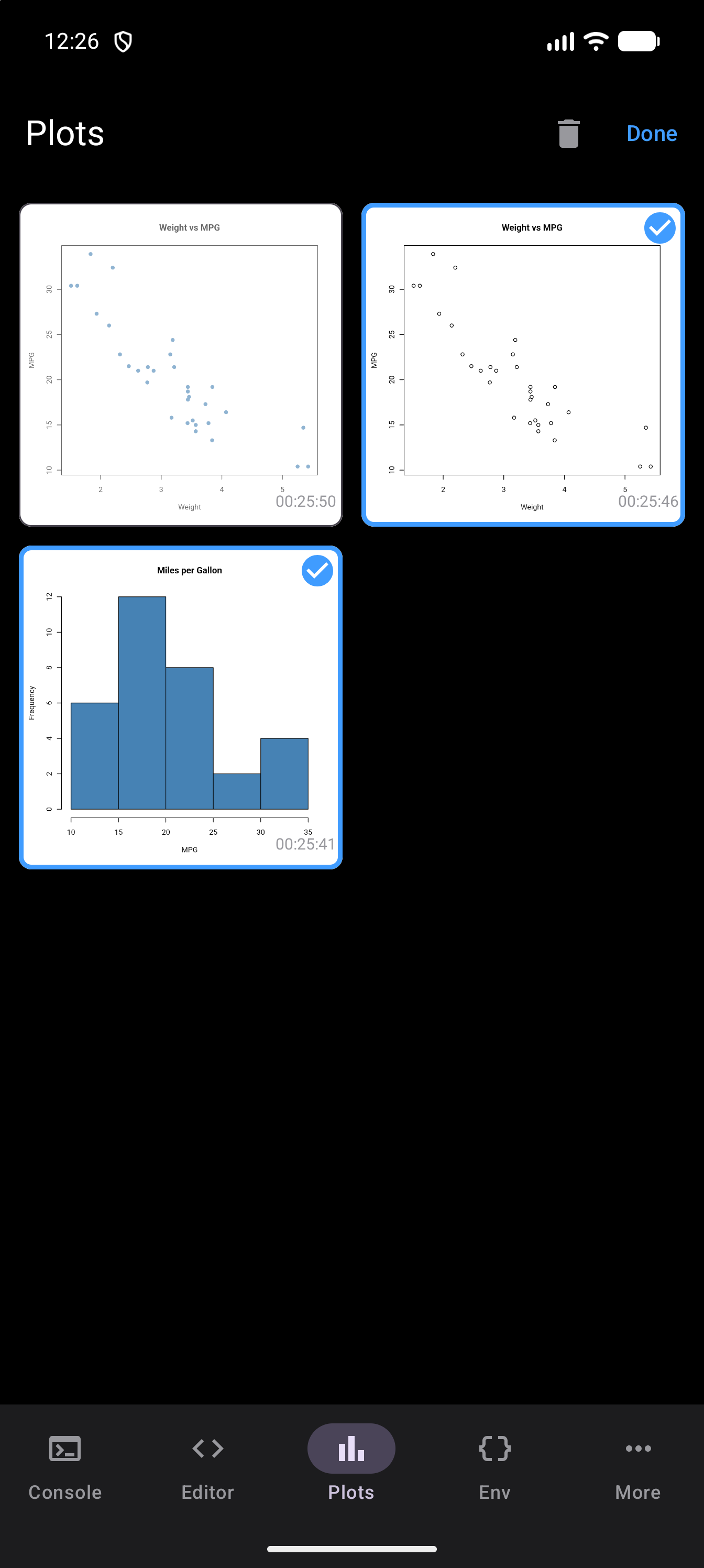
If your session has produced interactive plots (see Interactive Plots), a tab row appears at the top with Static Plots and Interactive tabs.
In the Workspace layout on a tablet, the Plots pane has no toolbar, so Compare, Select and Clear All Plots are not there. Everything else still works: tap a plot to open it, and share, export, pin or delete it from there, or long-press a thumbnail to share it. When you want to compare plots or clear several at once, switch Layout Mode in Settings to Tab Bar or Sidebar for a while. In the Workspace, Settings opens from the gear in the Environment pane’s header (see Layout Modes). Your plots stay in the gallery when you switch, and you can switch back to Workspace whenever you are done.
Viewing and Zooming
Tap any thumbnail to open it in the detail view, a full-screen bottom sheet where you can examine the plot closely.
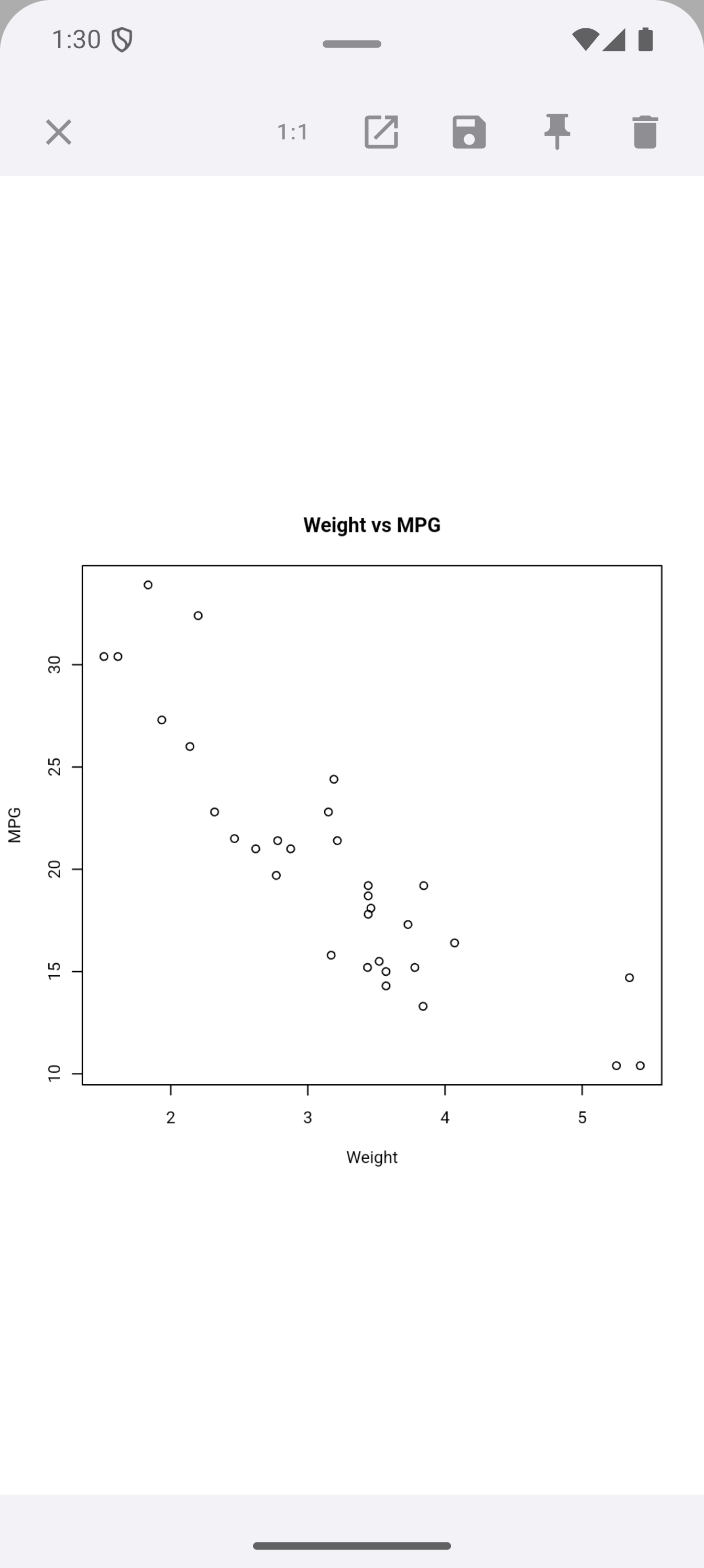
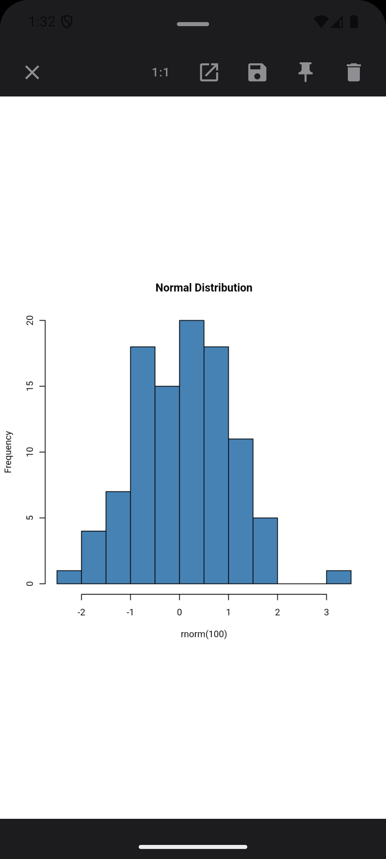
The detail view supports several touch gestures:
- Pinch to zoom: scale from 0.5x up to 5x magnification
- Drag to pan: when zoomed in, drag with one finger to move around the image
- Double-tap: toggles between 1x and 2x zoom, providing a quick way to zoom into a section and snap back
- Zoom buttons: Zoom out, Reset zoom and Zoom in buttons sit over the bottom of the plot, for zooming without a pinch. Reset zoom also undoes any panning.
- Ctrl and the scroll wheel: hold Ctrl and turn a mouse’s scroll wheel, or scroll with two fingers on a trackpad, to zoom by about 20% a notch, within the same limits. A scroll without Ctrl does not zoom. This also works in the full-screen view a floating plot card opens, and in a detached plot window.
How sharp a plot stays as you zoom depends on the size R drew it at, which the Plot Size setting in Settings > Plots controls.
The toolbar across the top of the detail view offers:
Share: shares the plot image
Detach to window: opens the plot in a window of its own, to keep beside your code. It opens next to the app in split screen, on a phone as well as a tablet or foldable (on a phone the two share the screen, one above the other), or as a separate window on a device with desktop windows. Each plot gets its own window, and detaching the same plot again brings its window back. The window has the same pinch, double-tap and zoom buttons as the detail view, and keeps its zoom and position when it is rotated, resized or changes theme. It keeps its plot while it is open or waiting in Recents, even after Android closes the app in the background. If you delete the plot from the gallery while its window waits in Recents, the window says “Plot not found on disk” when you return to it.
On a phone it looks like this, with the gallery above and the plot’s window below. The window’s title is the date and time the plot was drawn. The share button on the right shares the plot, and the X on the left closes the window and gives the app the whole screen again.
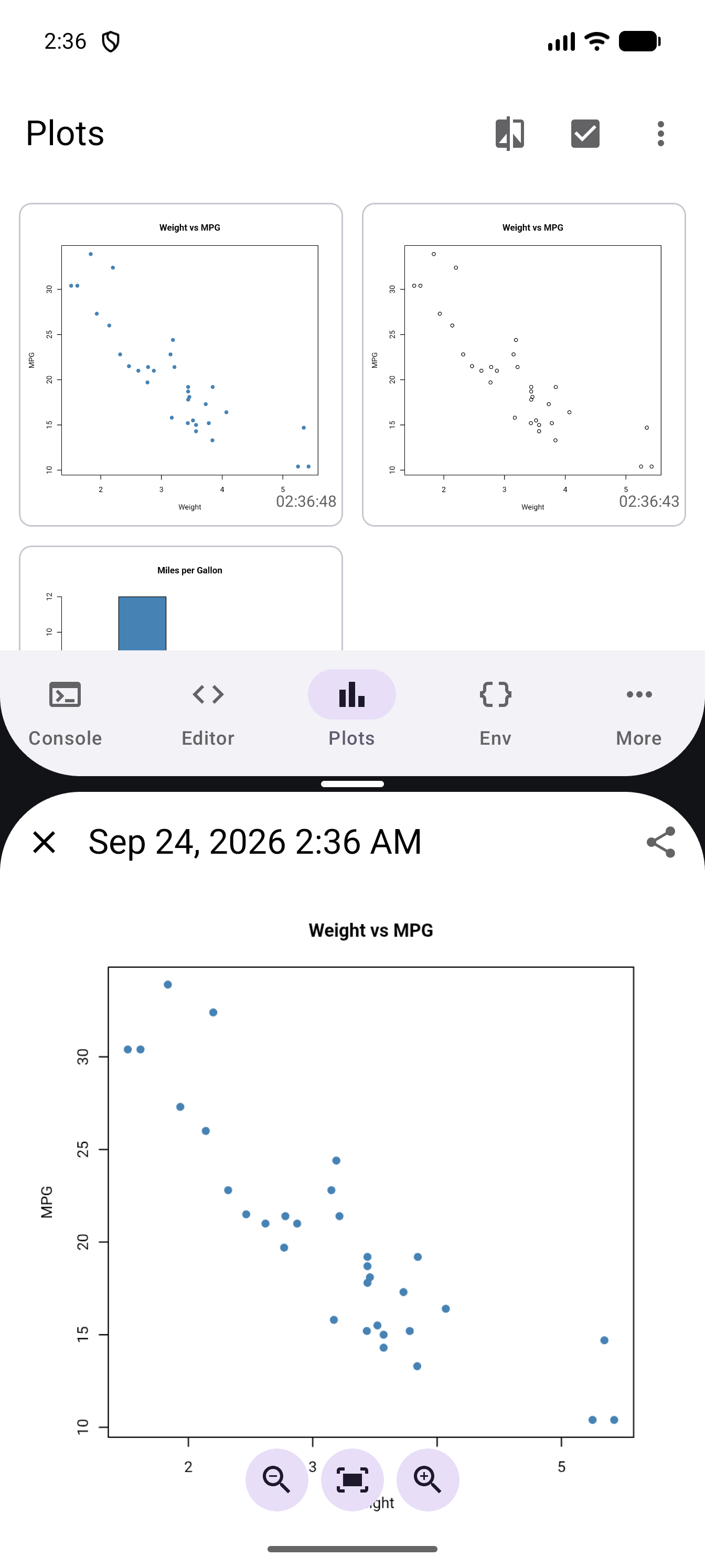
A phone in split screen, with the Plots gallery in the top half and a detached plot window in the bottom half showing a Weight vs MPG scatter plot, the date and time as its title, close and share buttons, and zoom buttons over the plot 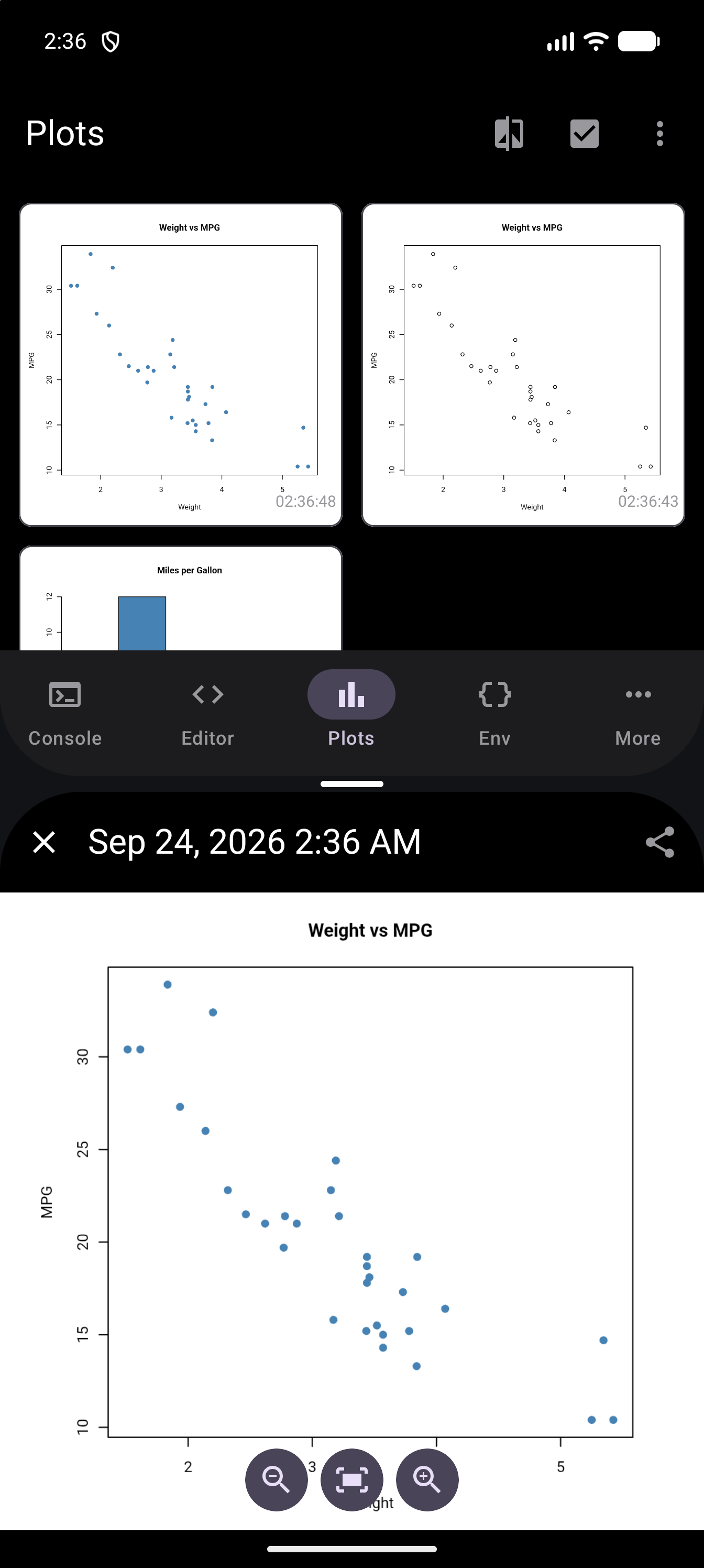
A phone in split screen, with the Plots gallery in the top half and a detached plot window in the bottom half showing a Weight vs MPG scatter plot, the date and time as its title, close and share buttons, and zoom buttons over the plot, in dark mode Export: opens the export sheet to save the plot to device storage
Pin/Unpin: pins the plot so it is protected from deletion (a pinned plot’s delete button is disabled)
Delete: removes the plot from the gallery (disabled when the plot is pinned)
Pinning is useful when you have a “good” version of a chart and want to iterate freely without risking it. Pinned plots are protected from both individual deletion and “Clear All Plots.”
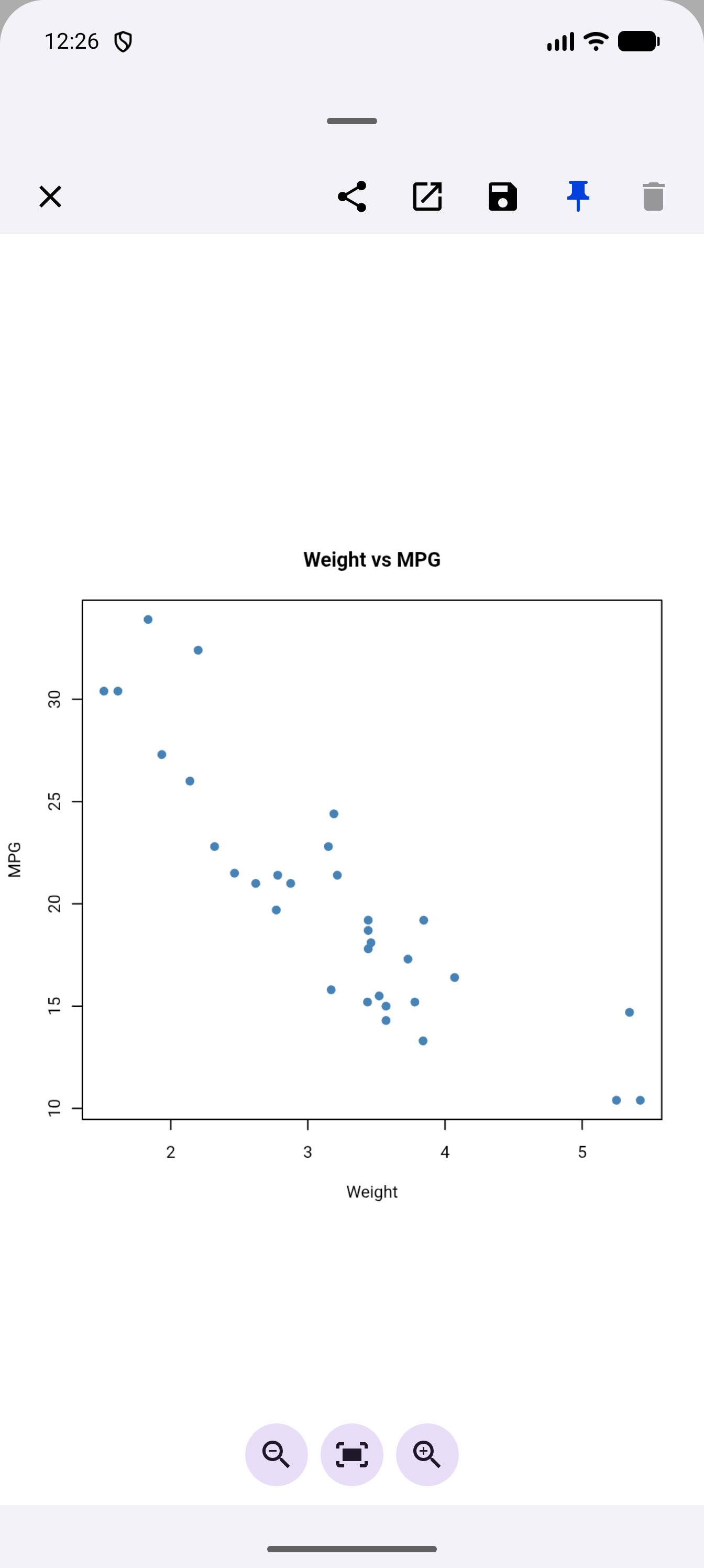
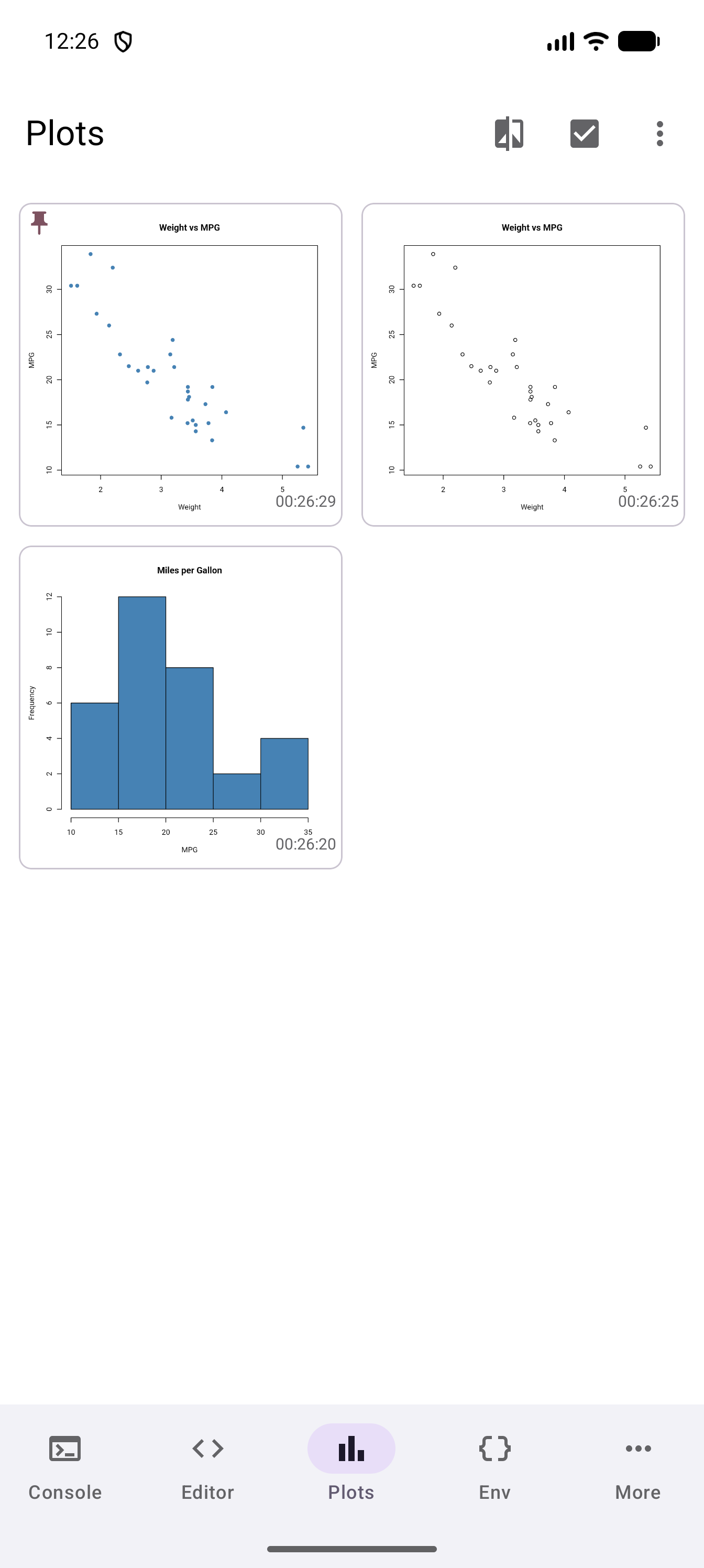
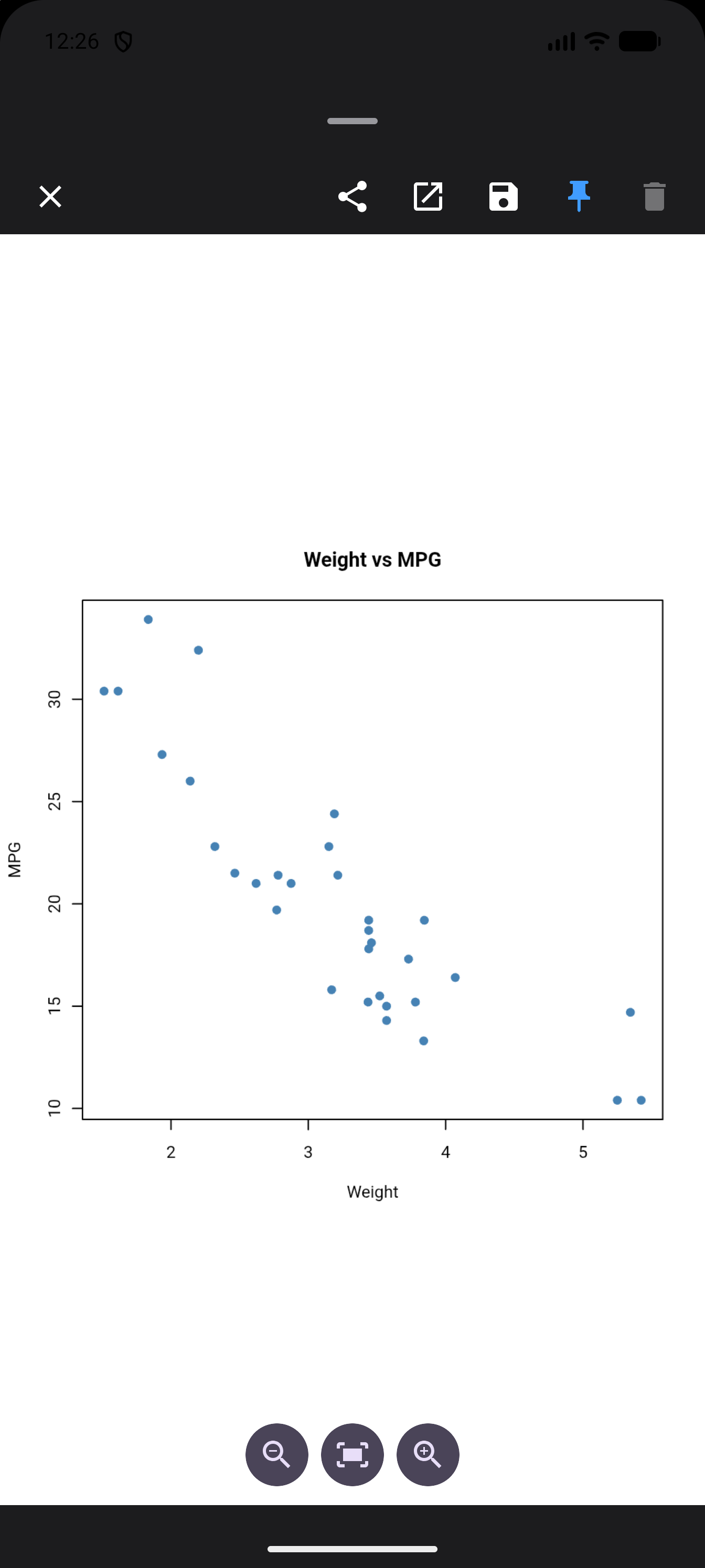
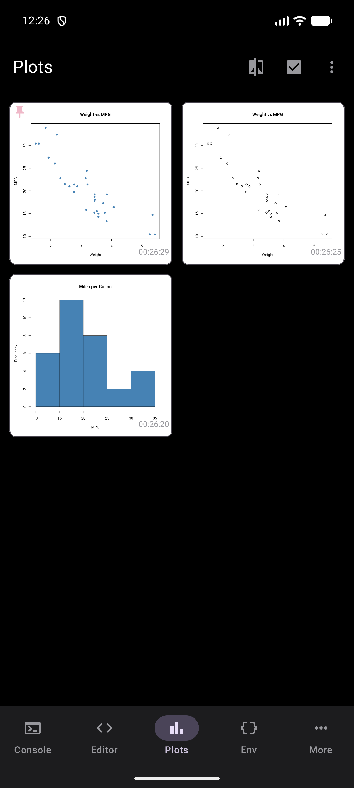
You can tell a pinned plot at a glance. In the detail view its pin button is highlighted and Delete is greyed out, and back in the gallery its thumbnail has a small pin in the top-left corner:
Comparing Plots
When iterating on a visualization, it helps to see the before and after together. webRoid’s comparison mode lets you do exactly that.
Comparison starts from the Plots toolbar, which the Tab Bar and Sidebar layouts have. The Plots pane in the Workspace layout has no toolbar, so if you use the Workspace on a tablet, switch to one of those layouts first, as Plot Gallery explains.
To compare two plots:
Tap the Compare icon in the toolbar (it appears when you have at least two plots)
Tap the two plots you want to compare. The first one you tap gets a badge with “1” in its top-right corner, the second gets “2”, and the plots you have not picked look faded. Tapping a badged plot again takes it back out.
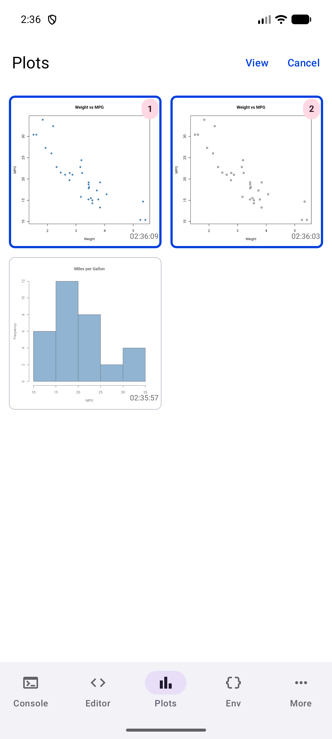
The Plots gallery in comparison mode, with a filled-dot and an open-circle Weight vs MPG scatter plot outlined in blue and badged 1 and 2, the Miles per Gallon histogram faded, and View and Cancel in the toolbar 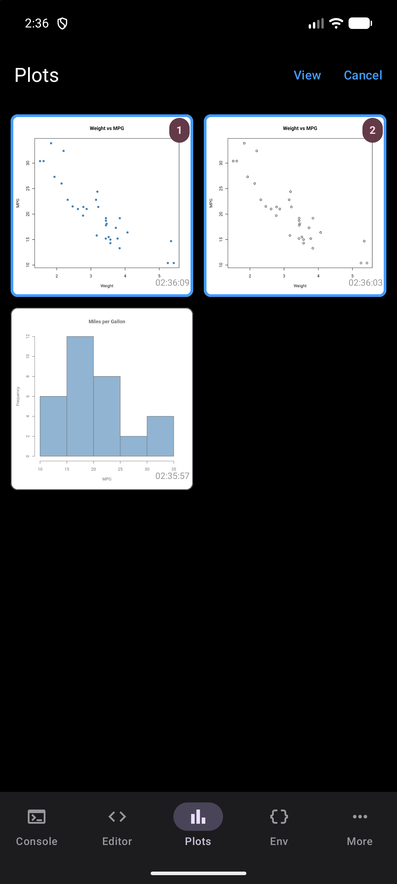
The Plots gallery in comparison mode, with a filled-dot and an open-circle Weight vs MPG scatter plot outlined in blue and badged 1 and 2, the Miles per Gallon histogram faded, and View and Cancel in the toolbar, in dark mode Tap View in the toolbar to open the comparison sheet
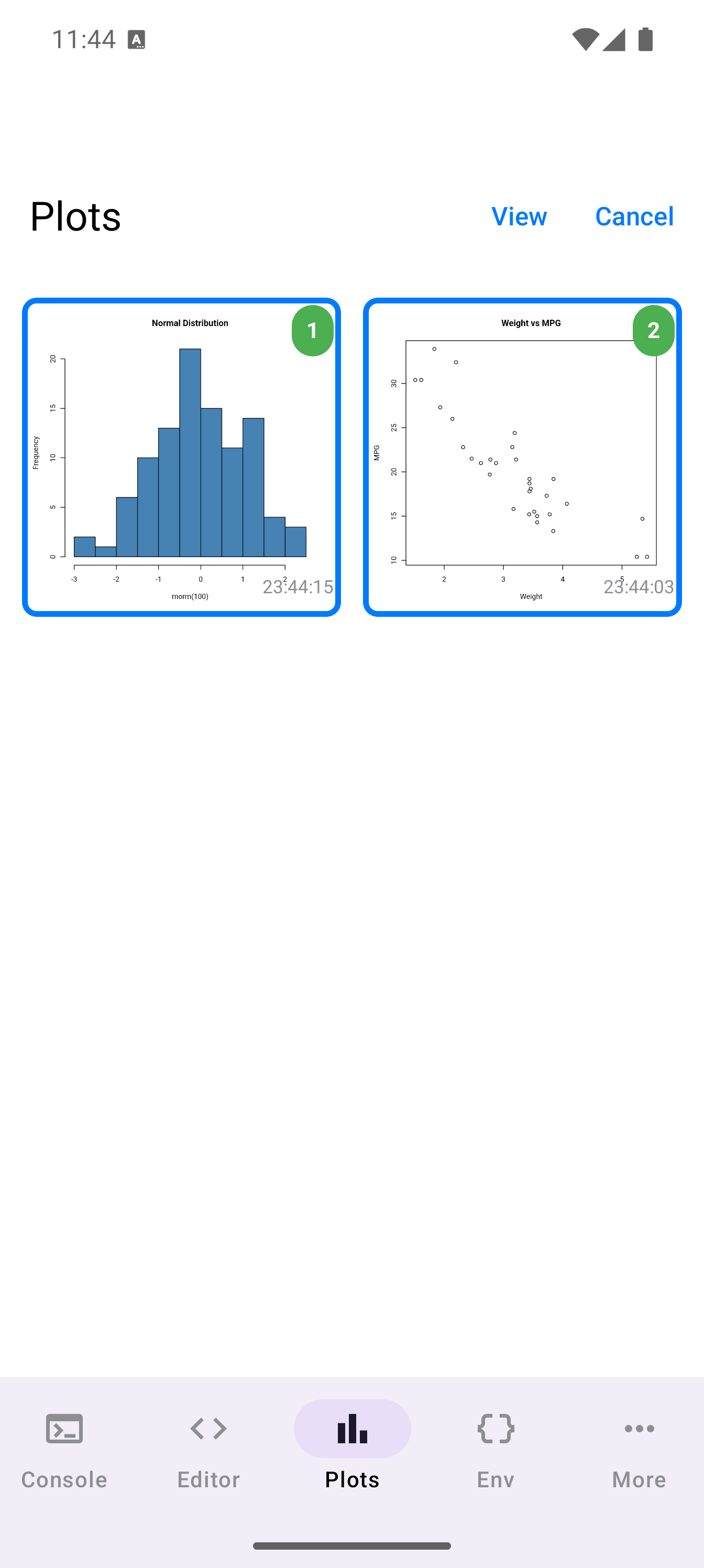
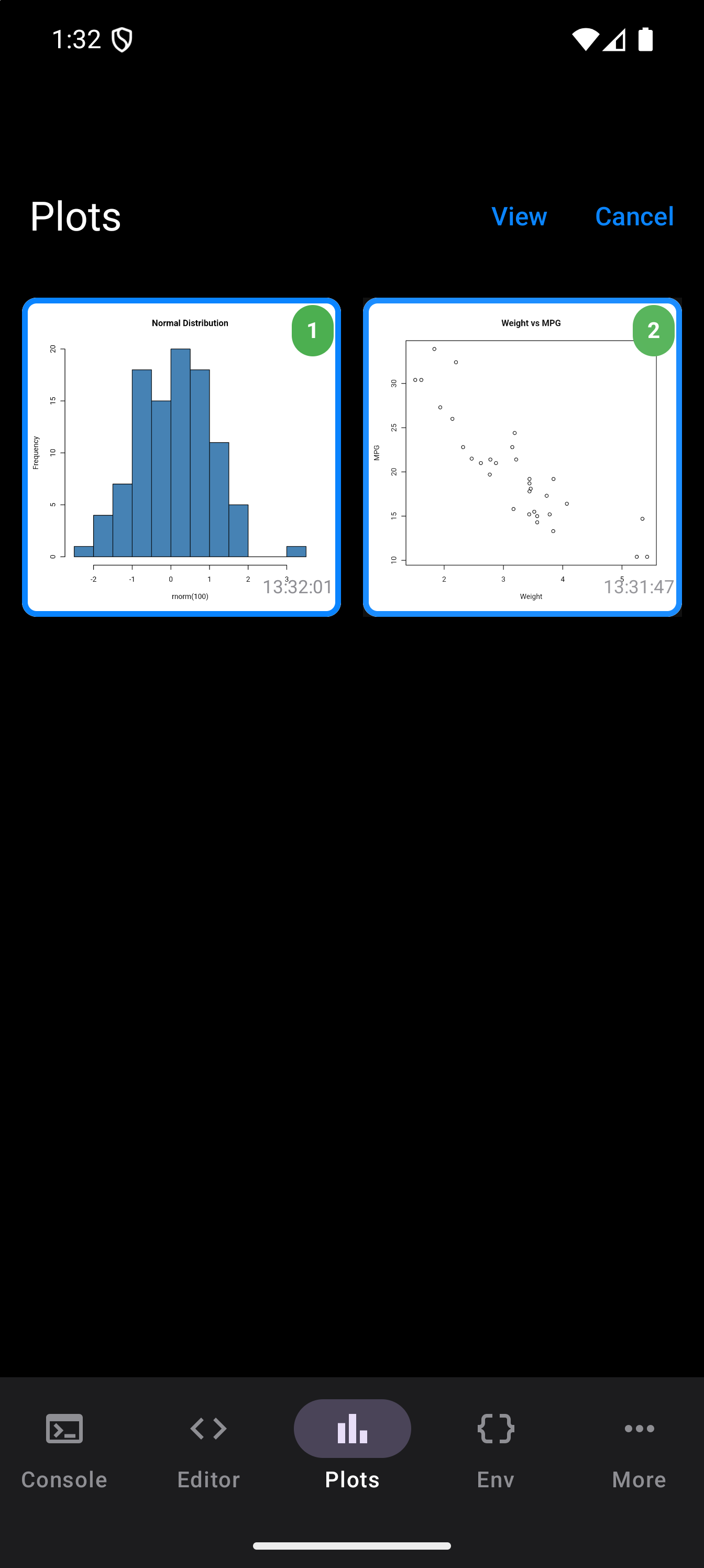
The comparison view shows both plots in a panel that slides up from the bottom, separated by a divider. On a phone held upright they are stacked, one above the other; on a tablet, or a phone on its side, the panel fills the screen and the plots sit side by side. Each plot area supports independent pinch-to-zoom and pan. By default, sync zoom is enabled, so zooming or panning one plot automatically mirrors the action on the other. This lets you inspect corresponding areas together. Tap the link icon to toggle sync off and control each plot independently.
Each plot also has its own Zoom out and Zoom in buttons, for zooming without a pinch. A Reset button returns both plots to their original 1x zoom and centered position.
Tap Cancel in the toolbar at any time to exit comparison mode without opening the viewer.
Sharing and Saving
There are two ways to get plots out of webRoid:
Export to file. From the detail view, tap the export (save) icon. The Export Plot sheet appears with:
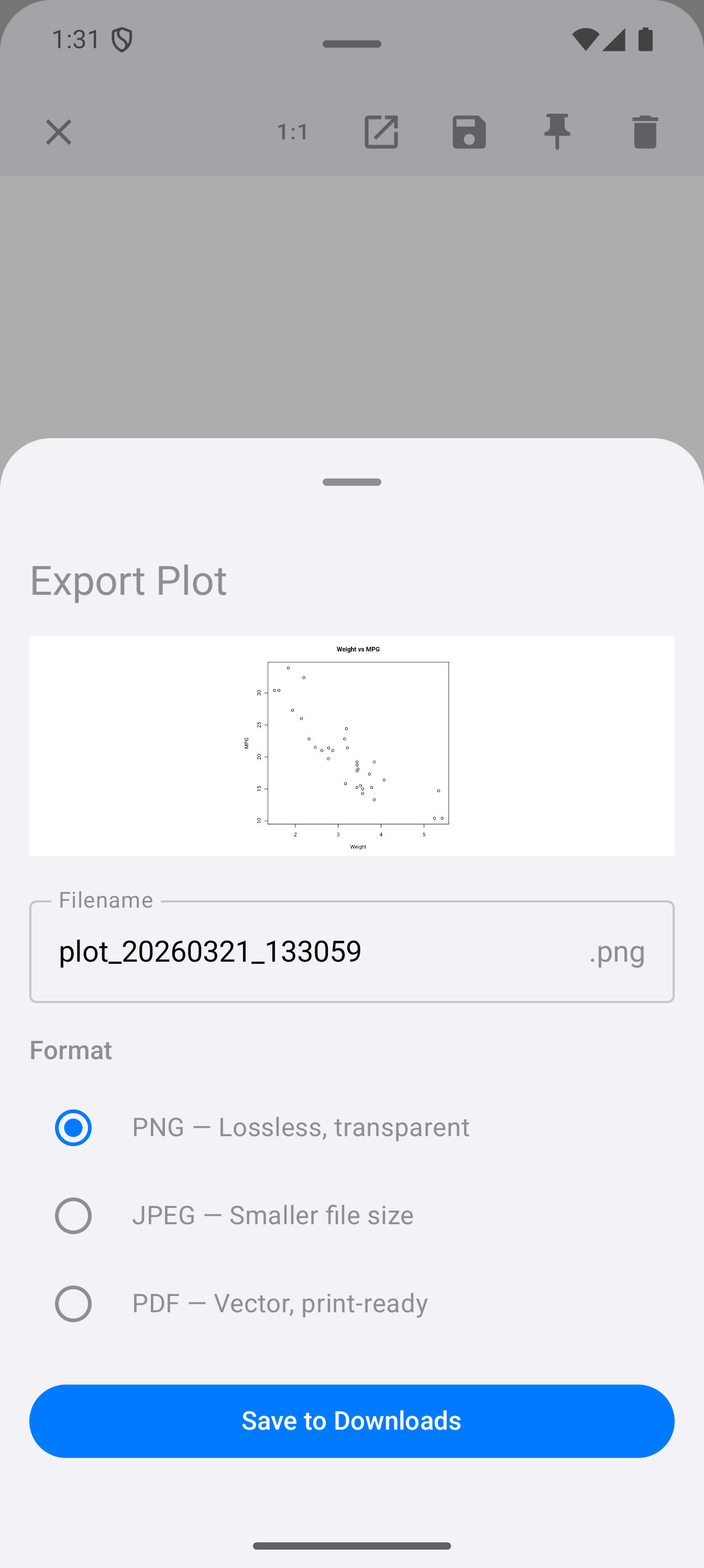
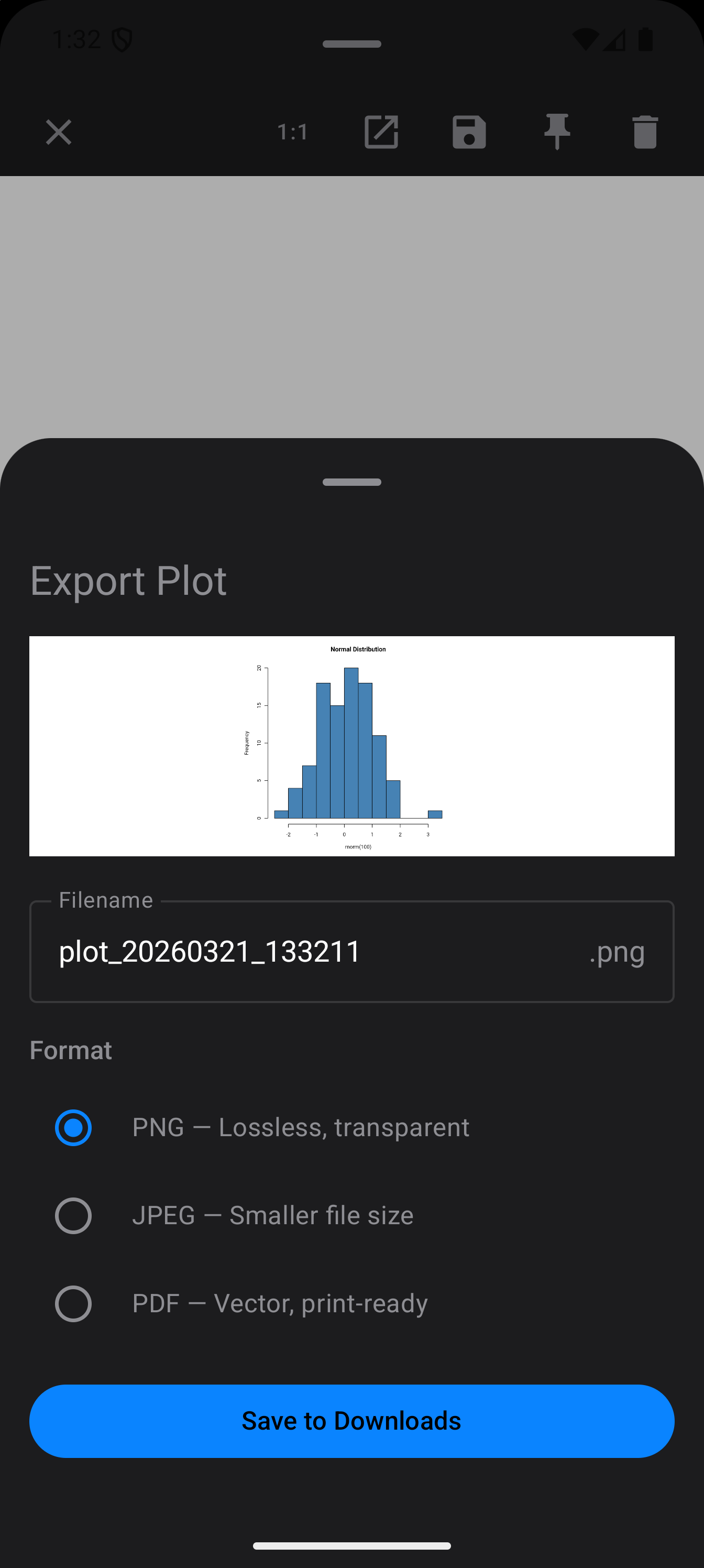
- A preview of the plot
- A filename field (defaults to
plot_YYYYMMDD_HHmmss) - Format selection with radio buttons:
- PNG: lossless, supports transparency
- JPEG: smaller file size
- PDF: vector container, suitable for printing and papers
- A Save to Downloads button that writes the file to your device’s Downloads folder using the Android MediaStore API
Share via Android share sheet. From the detail view toolbar, or by long-pressing a thumbnail in the gallery (or right-clicking it with a mouse or trackpad), you can share the plot image directly to any app that accepts images, such as Gmail, Messages, Google Drive, and social media apps.
The gallery does not survive a restart. It is built up as R draws, and it starts empty every time the app launches. Closing the app loses every plot in it. Leaving the app does not: going to the Home screen, switching apps or opening the system file picker keeps every plot. The app gives up unpinned plots, all but the newest, only if Android warns it that memory is critically short, a warning Android 14 and later no longer send.
The gallery also holds at most 20 plots. When a twenty-first arrives, the oldest unpinned plot is dropped to make room, so pin anything you are not finished with. Pinning protects a plot from eviction and from Clear All, but it does not carry it across a restart.
Anything you want to keep, export or share out of the app while you can see it.
Display Modes
By default, new plots appear only in the Plots tab. But you can change how plots are presented as they are generated. Go to Settings > Plots > New Plot Display and choose from four modes:
- Tab Only (default)
- Plots are saved silently to the Plots gallery. A badge on the Plots tab icon tells you how many new plots are waiting. This is the least intrusive option and works well when you are running batch scripts or do not need to see each plot immediately.
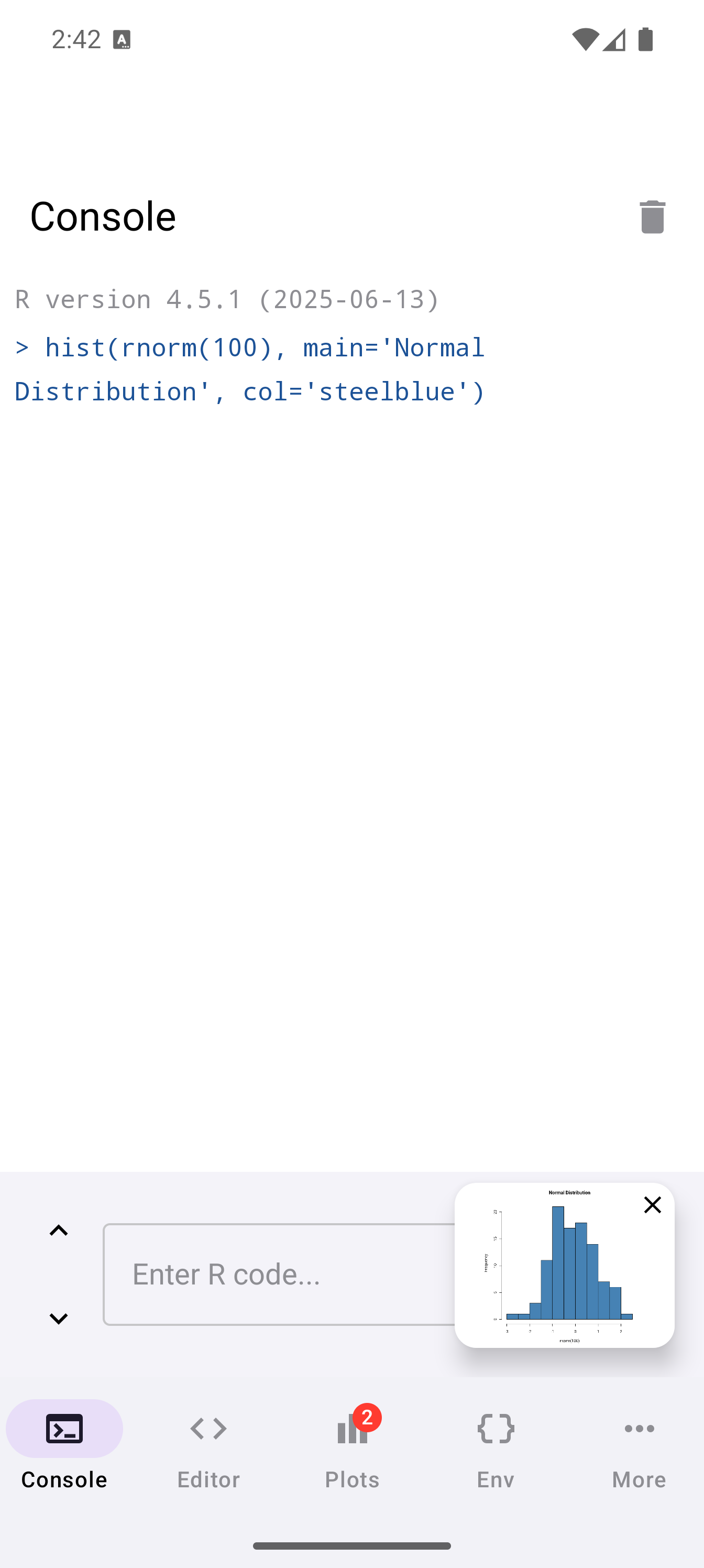
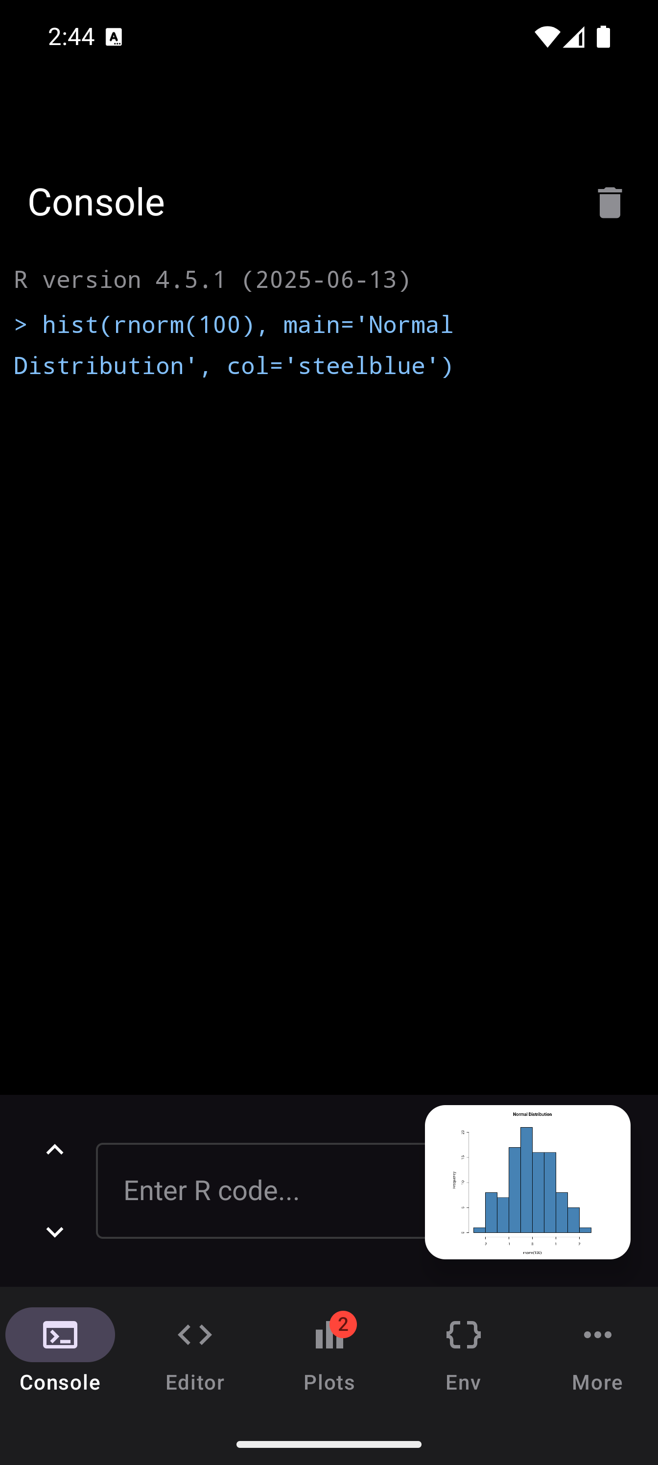
- Floating
- When a new plot is generated, a small floating thumbnail card appears in the bottom-right corner of whatever screen you are on. The card is draggable so you can reposition it, and it dismisses itself after five seconds, or after longer if you have set Time to take action in Android’s accessibility settings. It stays while you touch, drag or focus it. Tap the card to open the plot full screen, or tap its close button to dismiss it early.
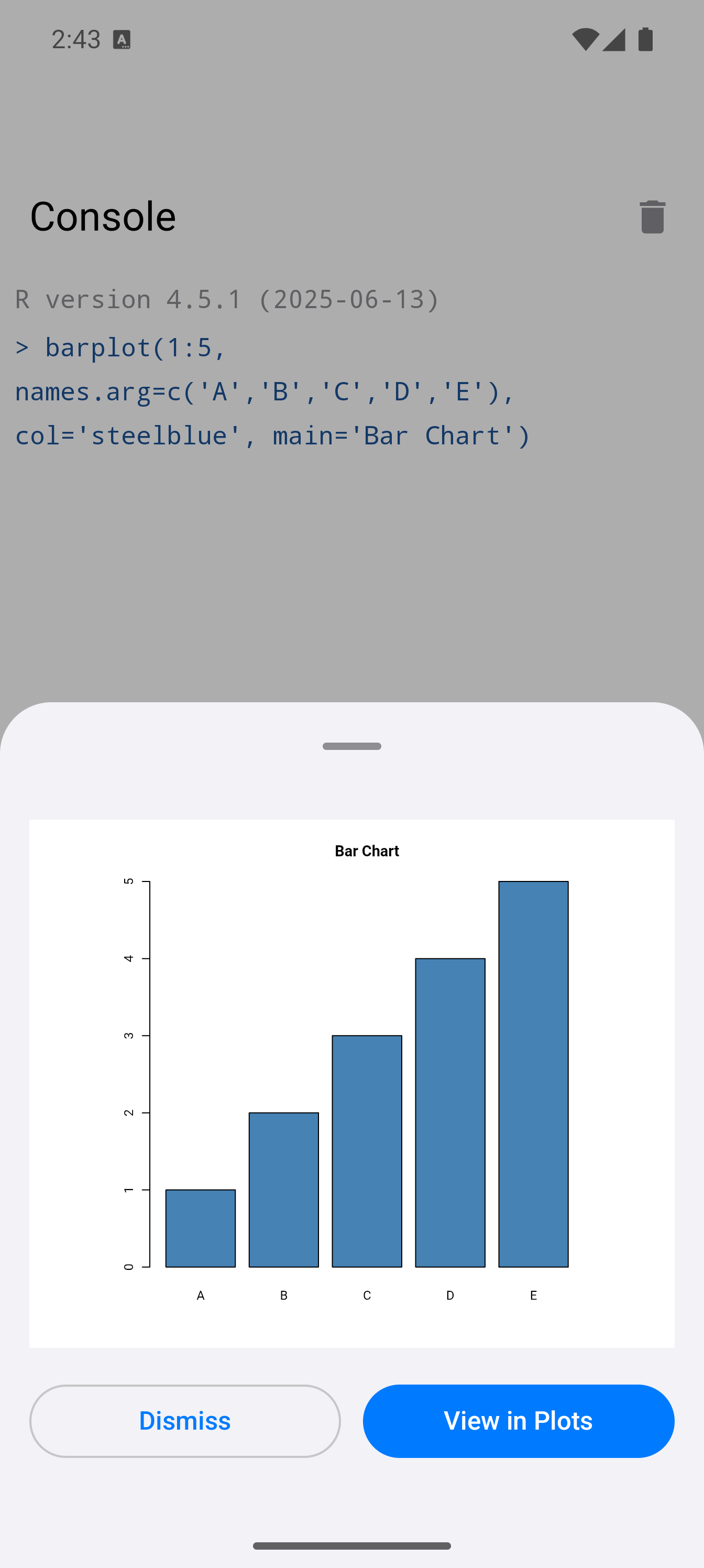
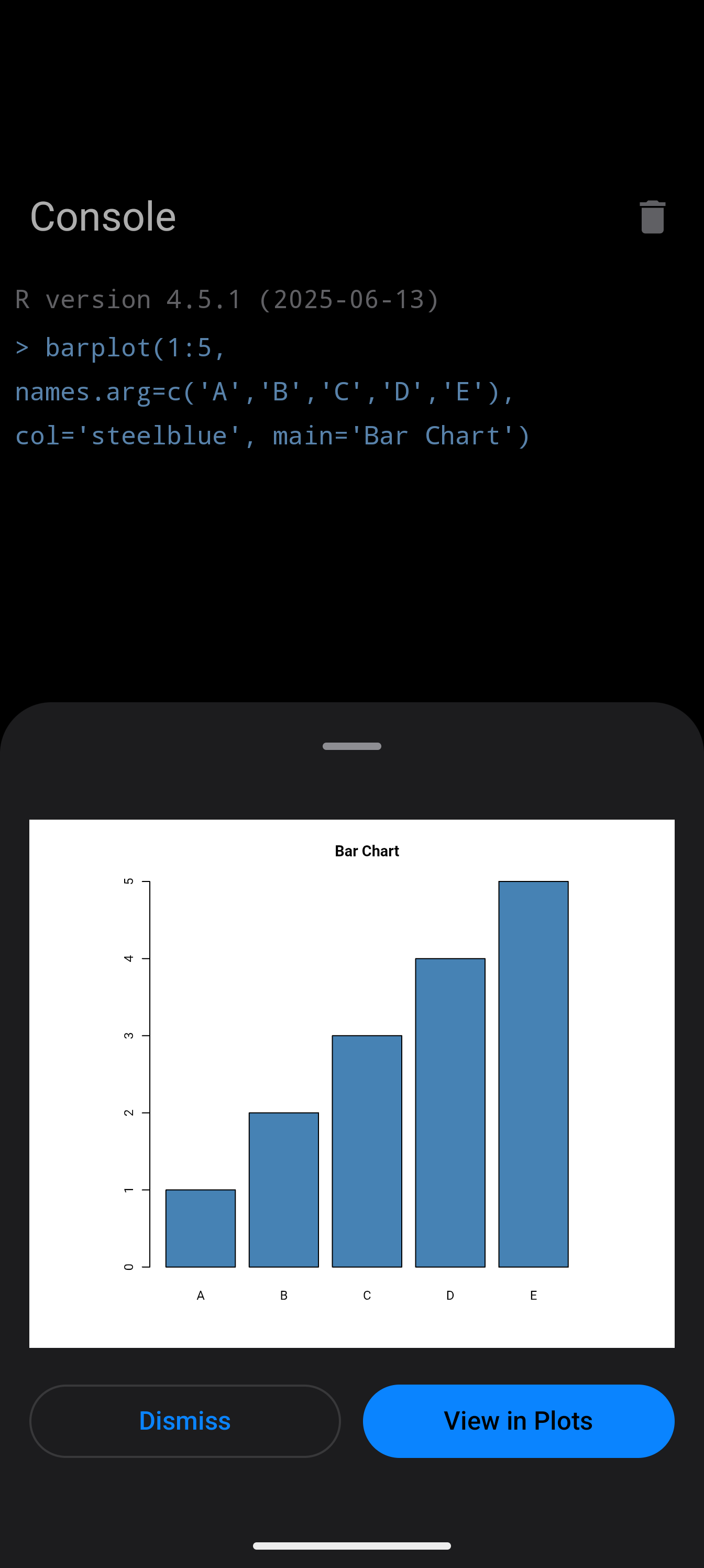
- Sheet
- New plots pop up in a sheet that slides up from the bottom of the screen, so you get a larger look at the plot without leaving what you are doing. Under the plot are two buttons. Dismiss closes the sheet. View in Plots opens the plot full screen, the same view a floating card opens, where you can pinch or use the zoom buttons to look closer. Swiping the sheet down or tapping outside it closes it too. Either way, the plot is also added to the Plots gallery.
- Inline
- Plots are inserted directly into the console output, appearing right after the code that generated them. This gives the most notebook-like experience, where code and output flow together.
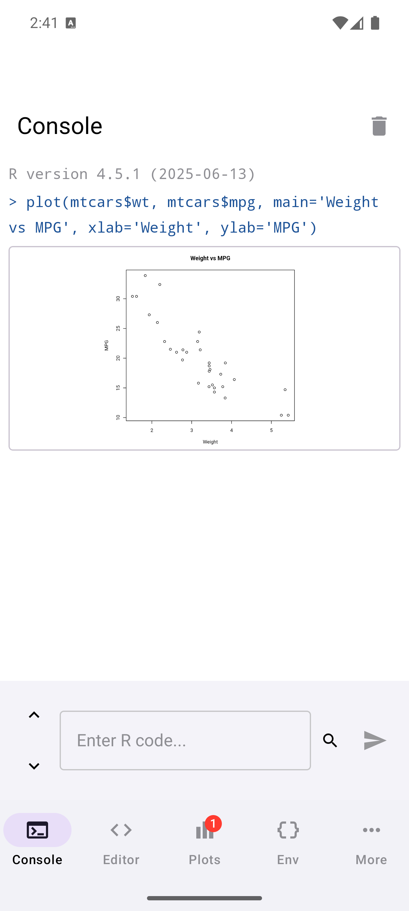
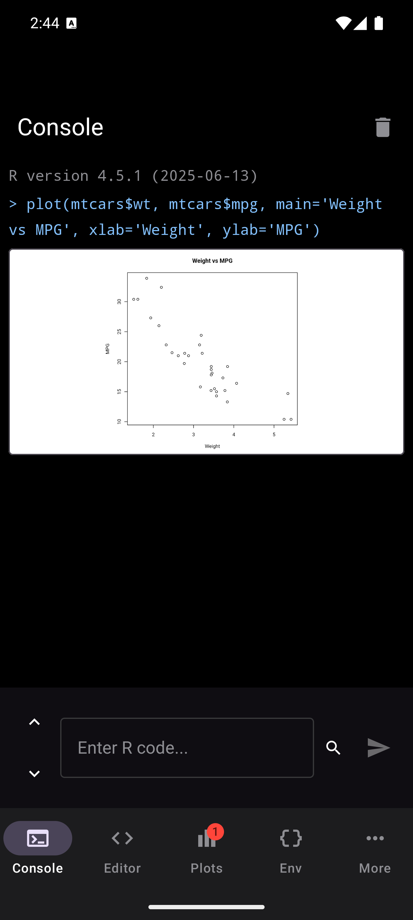
Floating is great when you are editing a script and want a quick glance at the output without switching tabs. Inline works best for exploratory work in the Console where you want to see everything in one stream. Tab Only is ideal for long-running scripts that produce many plots.