Themes
webRoid ships with nine built-in color themes and lets you create your own from scratch or import them from VS Code and RStudio. You can assign separate themes to light and dark mode, so the app always looks the way you want regardless of your system setting.
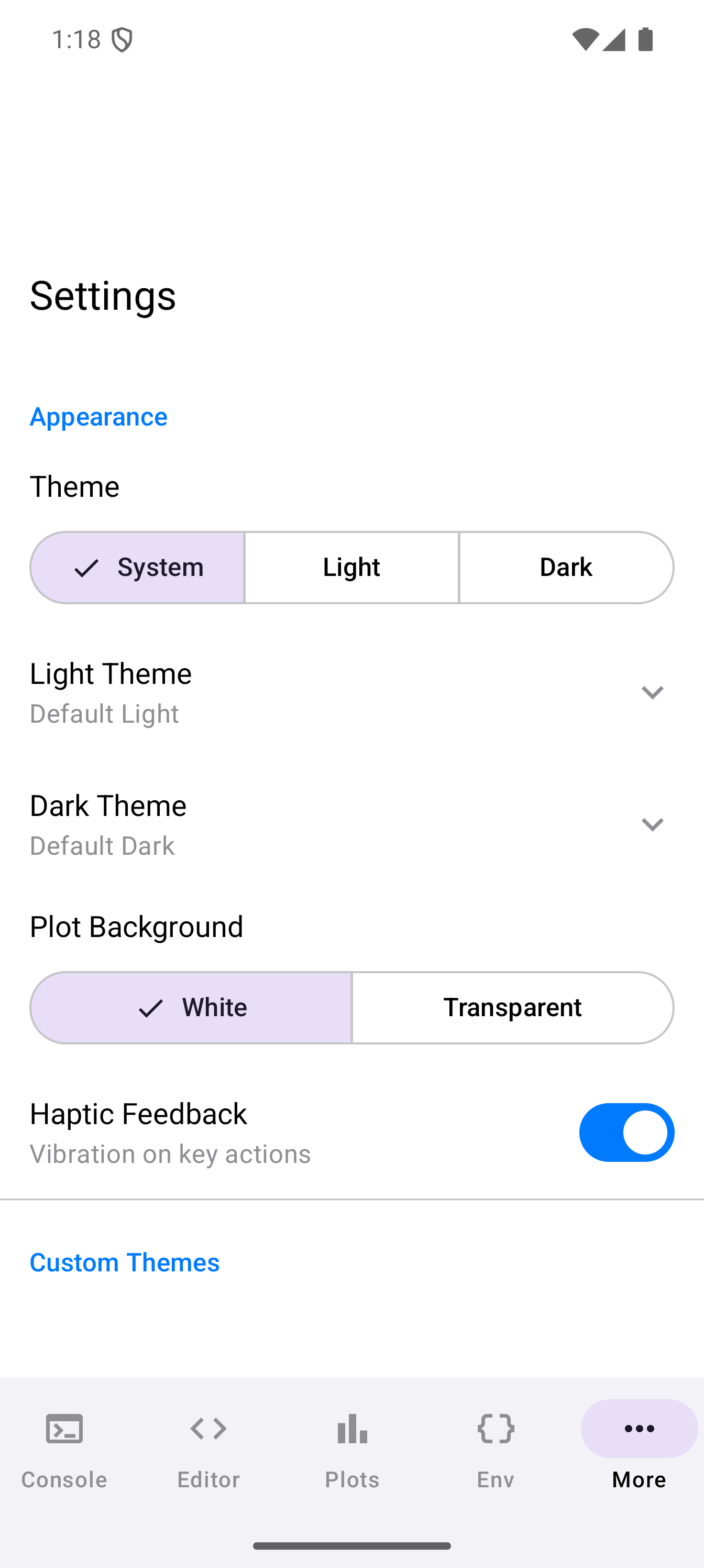
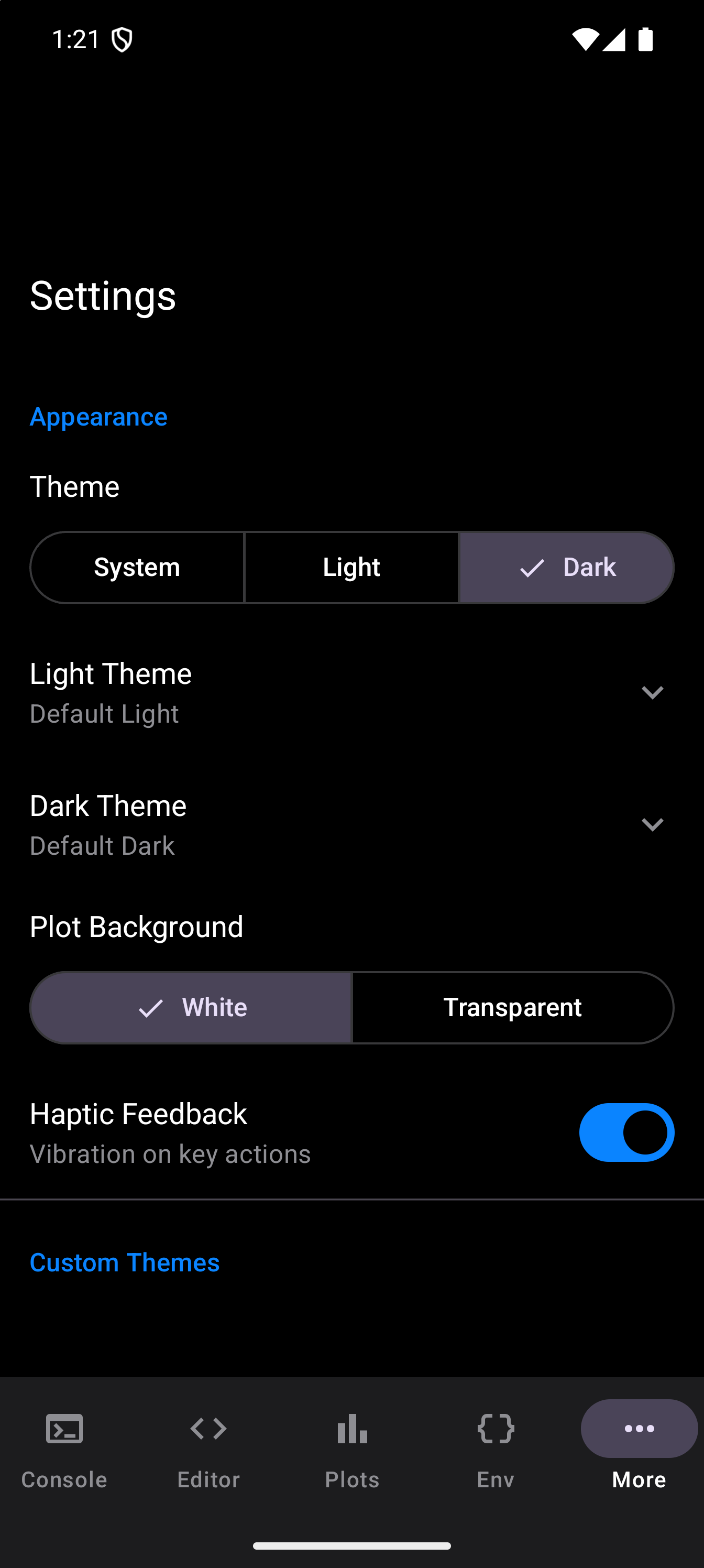
System Theme Mode
A segmented button at the top of the Appearance section in Settings controls whether webRoid follows your device:
| Option | Behavior |
|---|---|
| System | Follows your Android device theme. If your phone is set to dark mode, webRoid uses dark mode too. |
| Light | Always uses light colors regardless of your system setting. |
| Dark | Always uses dark colors regardless of your system setting. |
The change takes effect immediately. No restart needed.
Built-in Themes
webRoid includes nine themes organized by mode. Each theme defines colors for the editor, console, syntax highlighting, and the rest of the UI.
Light Themes
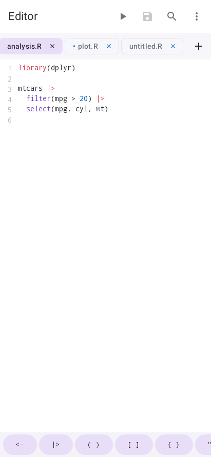
A clean, neutral palette with soft grays and blue accents. The standard starting point.
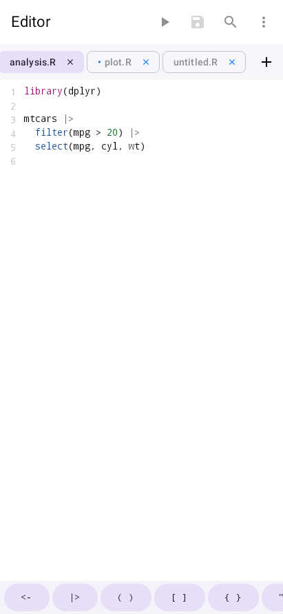
Ethan Schoonover’s warm, low-contrast palette designed for long reading sessions.
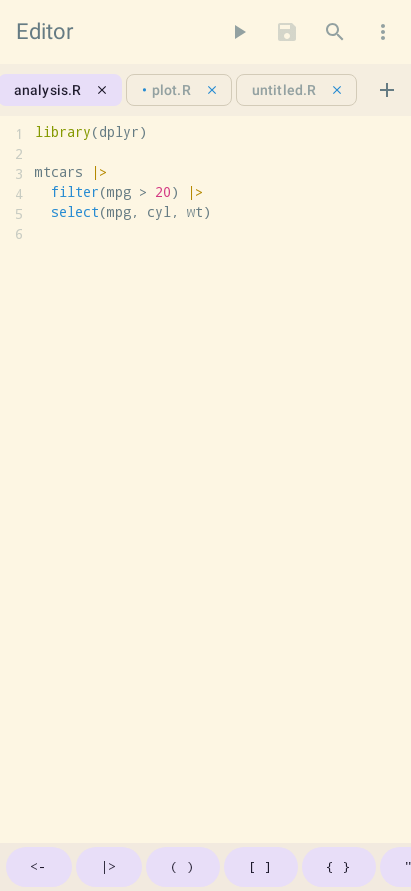
Modeled on the GitHub code view. Familiar if you spend time reading code on the web.
Dark Themes
A balanced dark palette with comfortable contrast and blue accents.
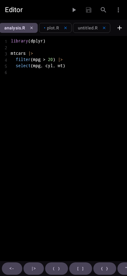
A popular dark theme with vivid purples, pinks, greens, and cyans on a deep background.
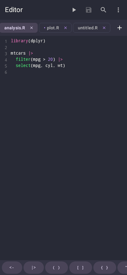
The dark counterpart to Solarized Light, with the same carefully tuned color relationships.
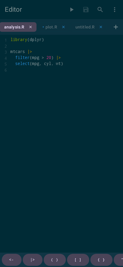
Warm, saturated colors on a near-black background. A classic for code editors.
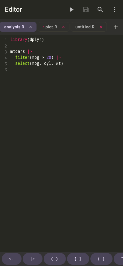
Inspired by Atom’s default dark theme, with muted blues, purples, and greens.
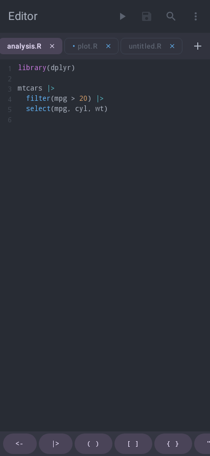
An arctic color palette with cool blues and soft contrasts, designed to be easy on the eyes.
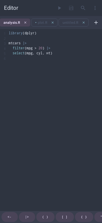
Choosing a Theme
You can assign a different theme for light mode and dark mode independently. This means you can use GitHub Light during the day and Dracula at night, and webRoid will switch automatically when your system mode changes.
To choose a theme:
- Open Settings and scroll to the Appearance section
- Tap Light Theme to expand the light theme picker
- Each row shows the theme name and five color swatches representing its key colors (background, accent, keyword, string, comment)
- Tap a row to select it. The change applies immediately.
- Repeat with Dark Theme to choose your dark mode theme
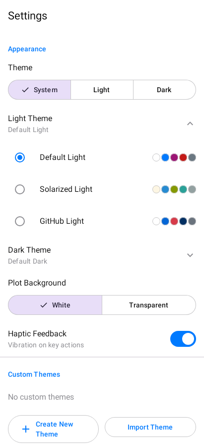
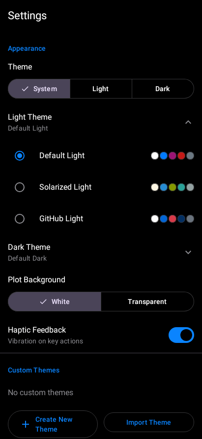
The five color swatches next to each theme name give you a quick preview without switching. Look for colors that match your preferences before tapping.
Contrast
Default Light and Default Dark meet the WCAG AA contrast ratio of 4.5:1 for text on every surface the app draws on, sheets and dialogs included, and their syntax colors meet it against the editor background and the highlighted current line.
The other built-in themes reproduce palettes from other editors and are drawn as their authors designed them, so some of their colors fall below AA. Dracula’s comments, for example, are about 3:1, and Solarized Light’s about 2.5:1.
Android 14 and later have a system-wide contrast level, Standard, Medium or High, in the accessibility or display settings (the name and place vary by device). webRoid follows it, and changes as soon as you do:
| Contrast level | What webRoid does |
|---|---|
| Standard | Every theme is drawn exactly as designed. |
| Medium | Any text color below 4.5:1 (WCAG AA) on the surface it sits on is darkened or lightened until it reaches it. |
| High | The same, to 7:1 (WCAG AAA), as far as the background allows. |
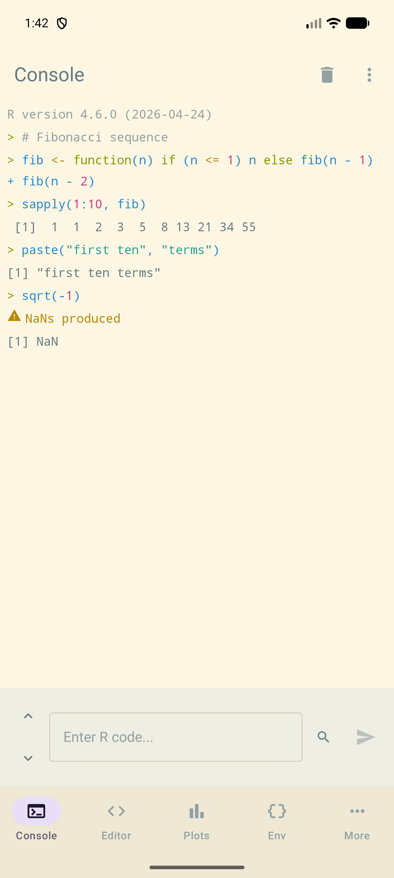
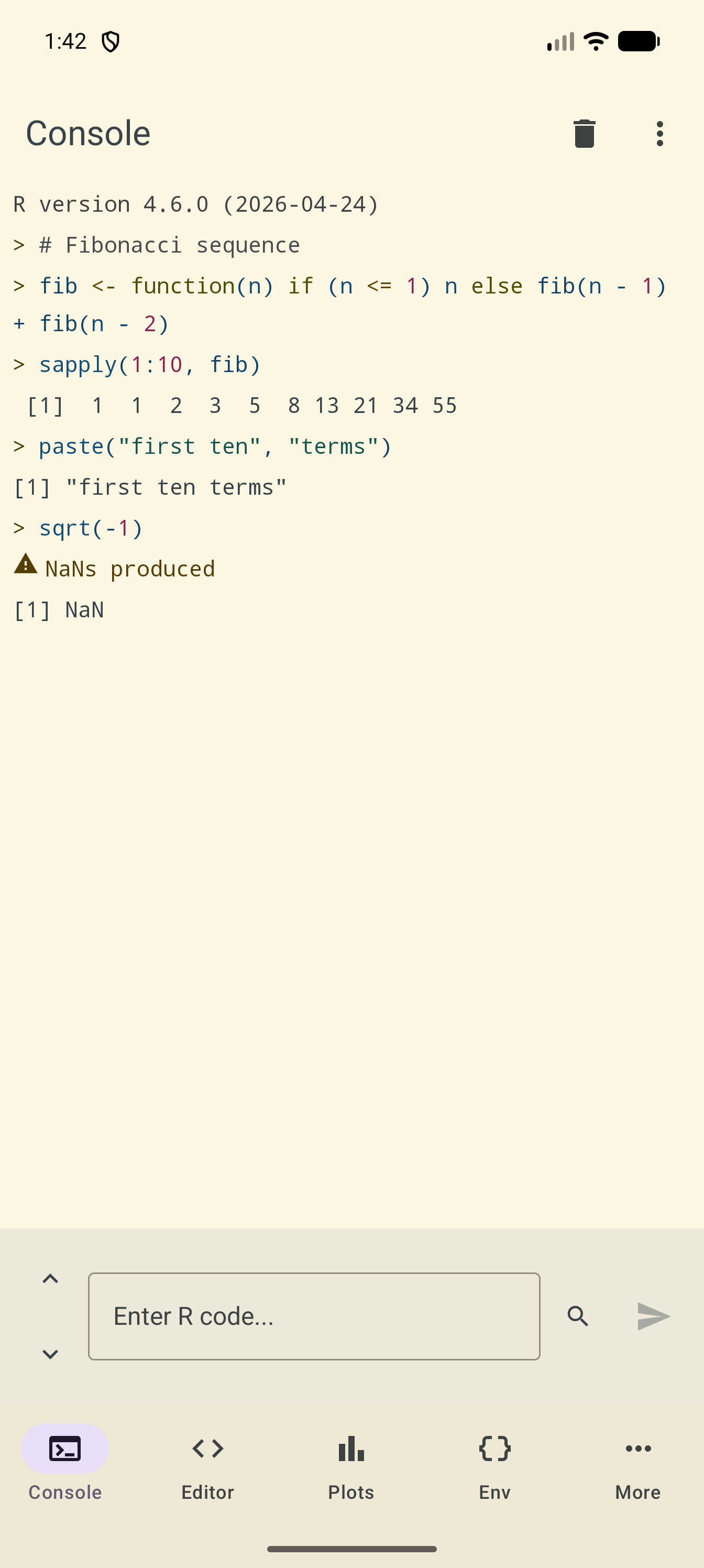
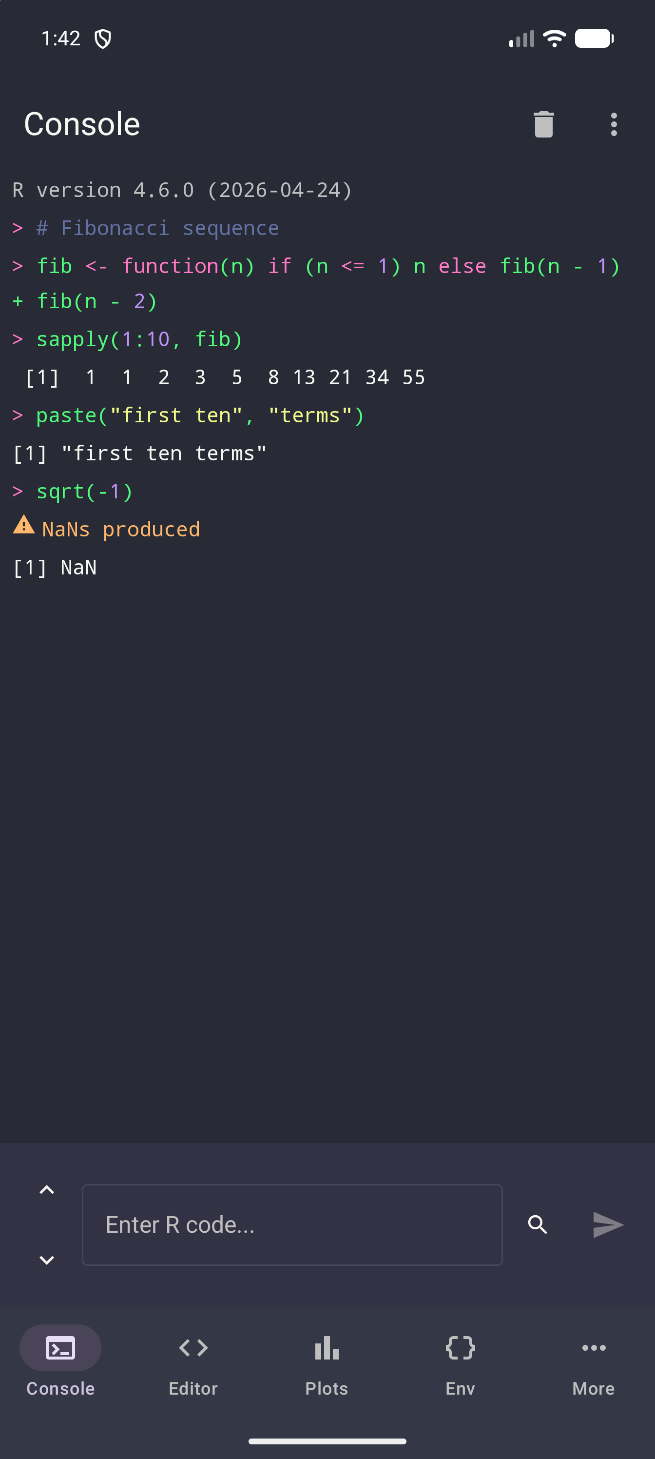
Here is the same Console at Standard contrast and then at High. The pictures use Solarized Light, or Dracula if you are reading this page in dark mode. At High, the # Fibonacci sequence comment is darker in Solarized Light and lighter in Dracula, and the background stays the same:
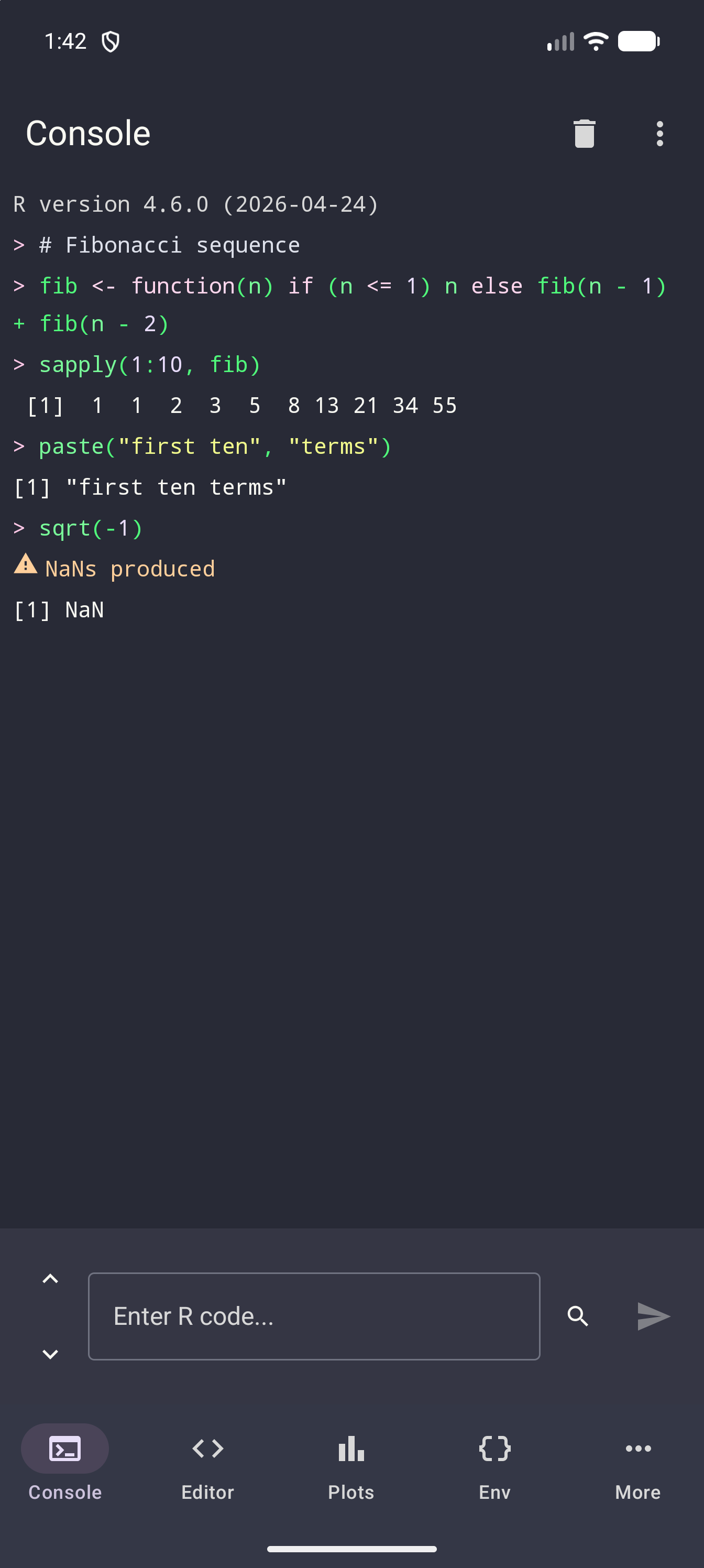
The adjustment covers every theme, custom and imported ones included, and every text color in it: syntax, console output, and the rest of the interface. Colors that already meet the level are left alone, and backgrounds never change, so a theme keeps its character. See also Colour and contrast in the Accessibility guide.
Creating Custom Themes
If none of the built-in themes are quite right, you can create your own.
Opening the Theme Editor
- Open Settings and scroll to Custom Themes, the section directly below Appearance
- Tap Create New Theme to open the editor
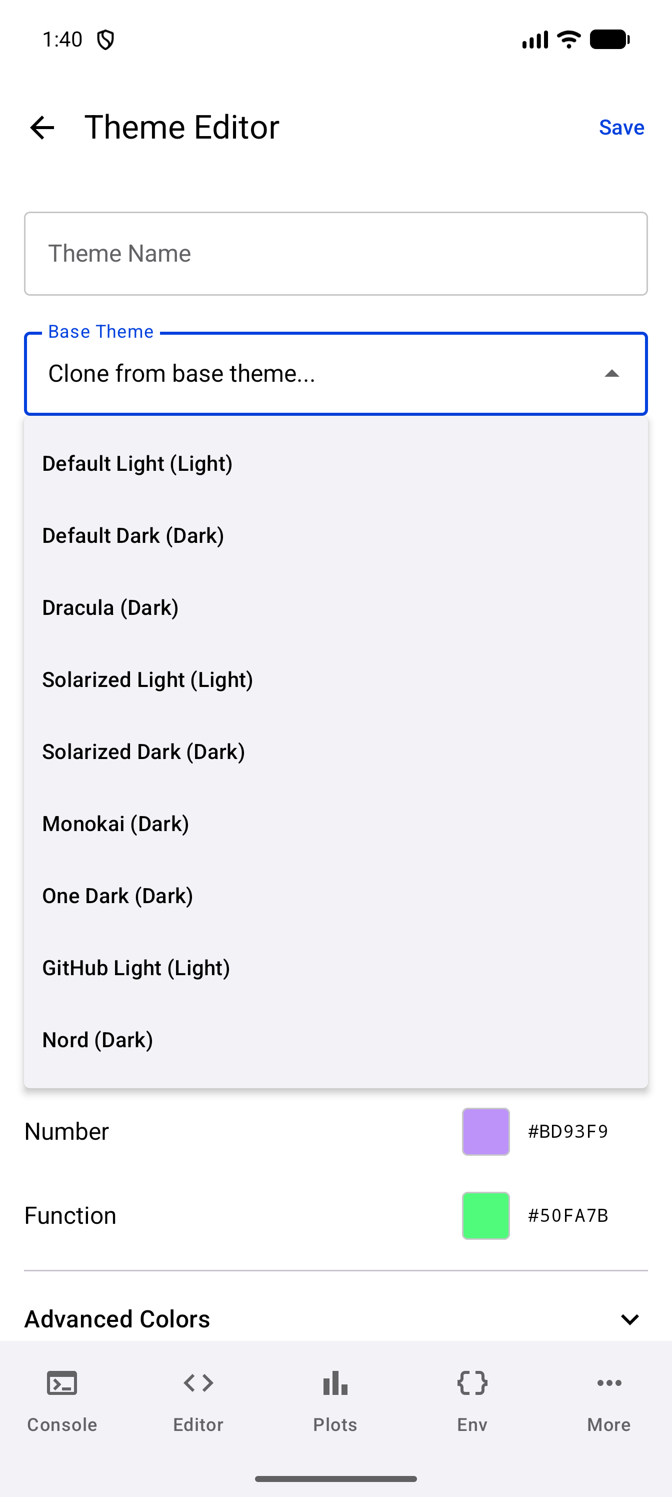
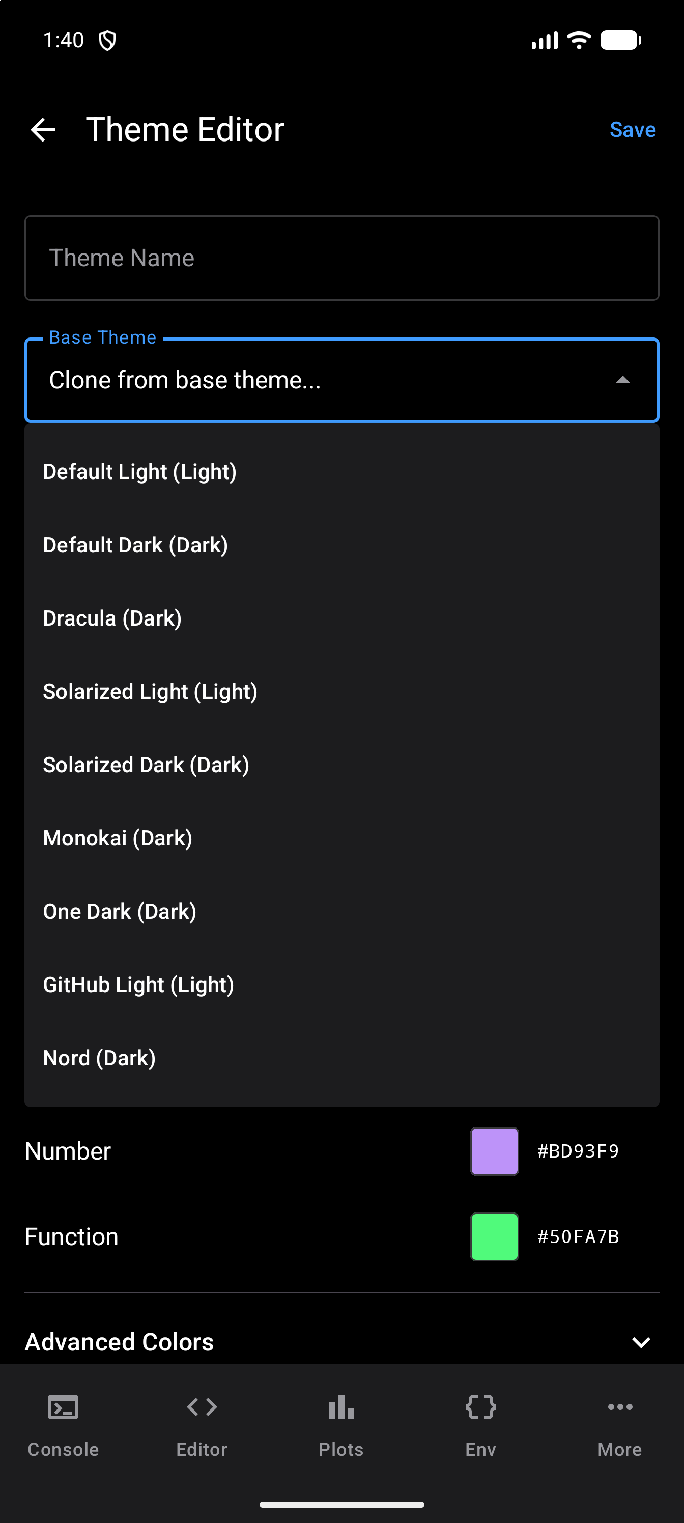
- Optionally, tap the Base Theme field, which reads “Clone from base theme…”, and choose a theme to copy its colors as a starting point. The list holds the nine built-in themes, each marked Light or Dark, and any custom themes you have made. Until you choose one, a new theme starts with Dracula’s colors.
Key Colors
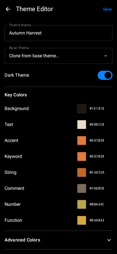
The Theme Editor presents eight key colors that define the core look of your theme:
| Color | What it controls |
|---|---|
| Background | Main editor and console background |
| Text | Default text color |
| Accent | UI highlights, buttons, active indicators |
| Keyword | R keywords like if, for, function, library |
| String | Quoted strings |
| Comment | Code comments |
| Number | Numeric literals |
| Function | Function names and calls |
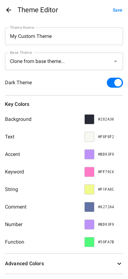
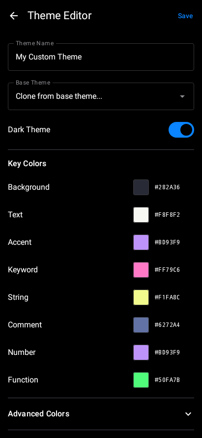
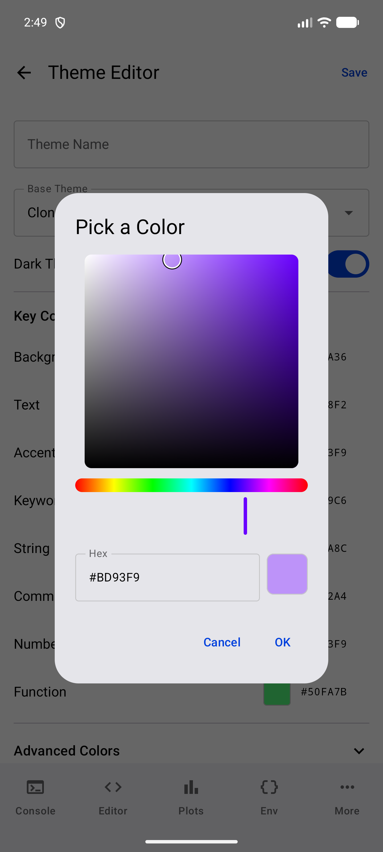
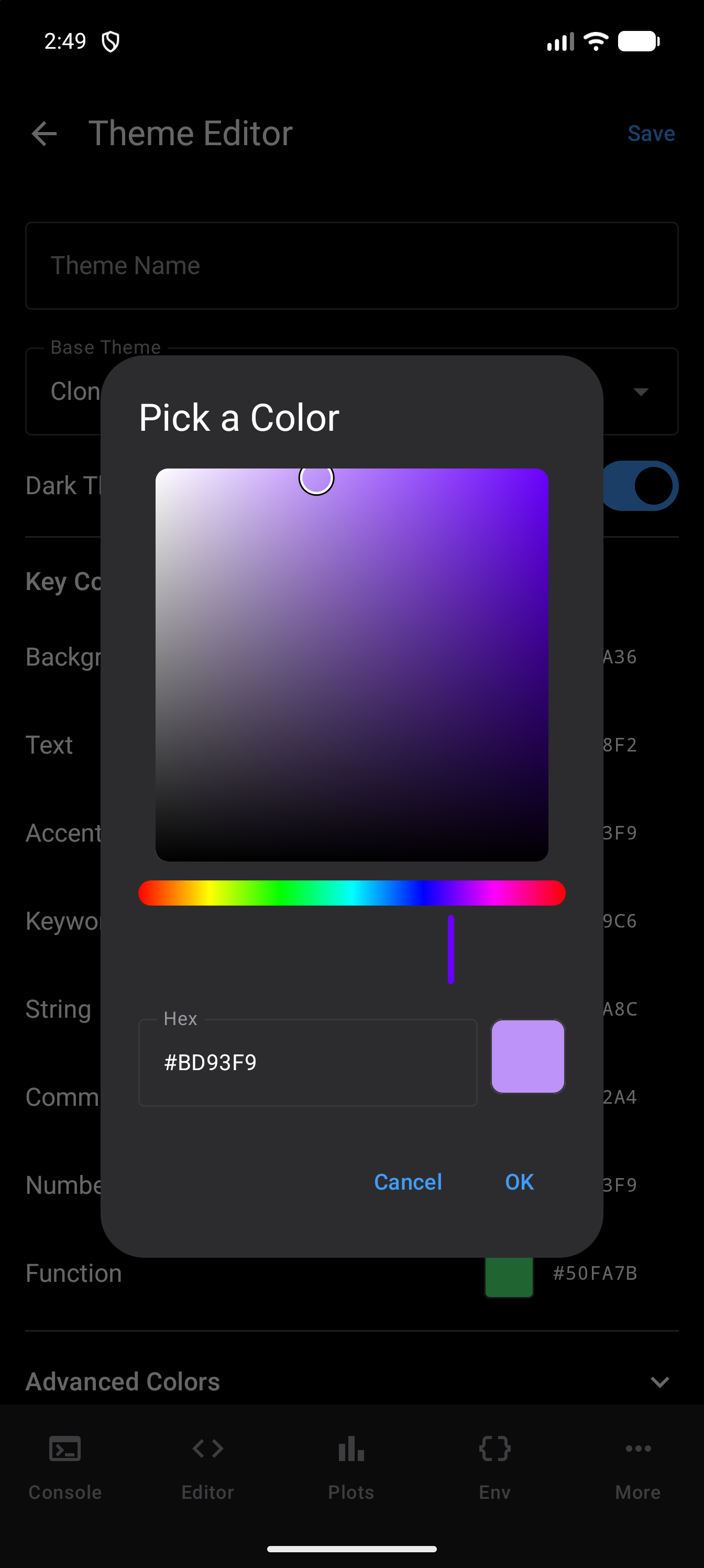
Tap any color to open the Pick a Color dialog. Drag in the large square to change the color’s saturation and brightness, drag along the rainbow slider below it to change the hue, or type a hex value such as #1E1E2E into the Hex field. The swatch beside the field shows the result. Tap OK to use it, or Cancel to keep the color you had.
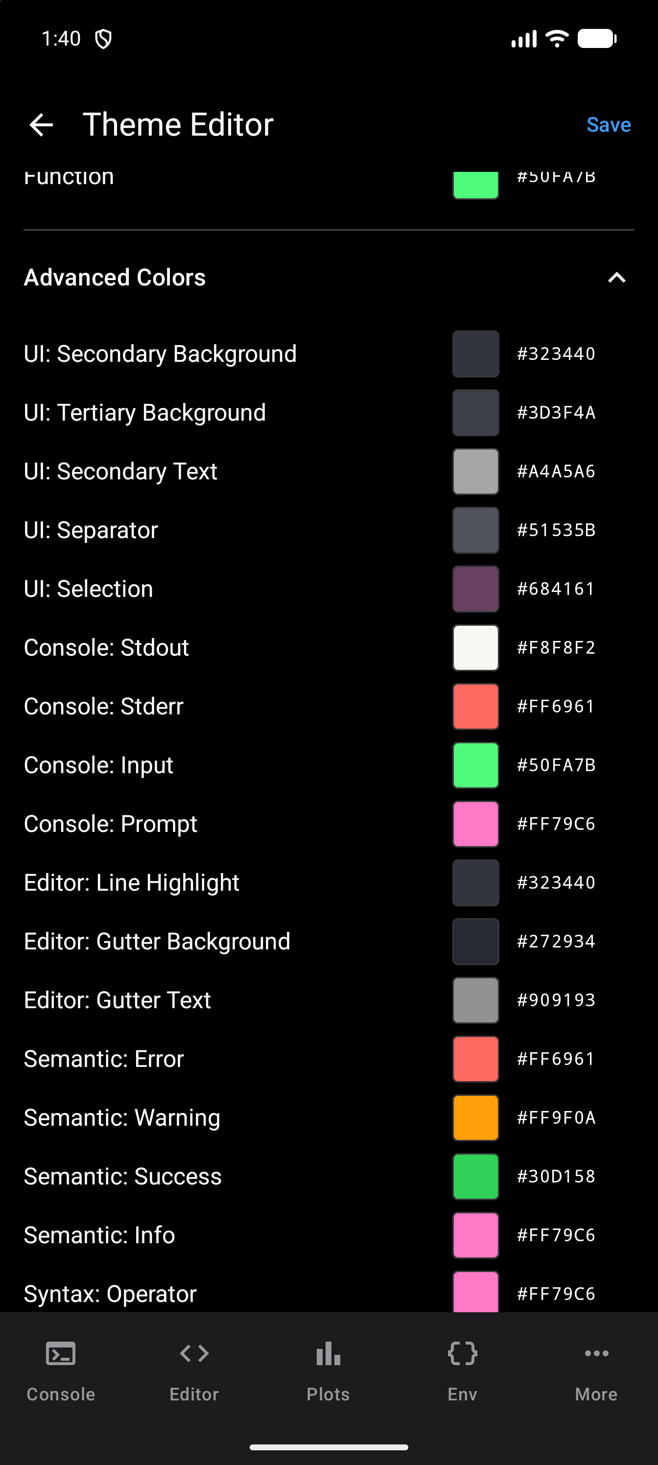
Advanced Colors
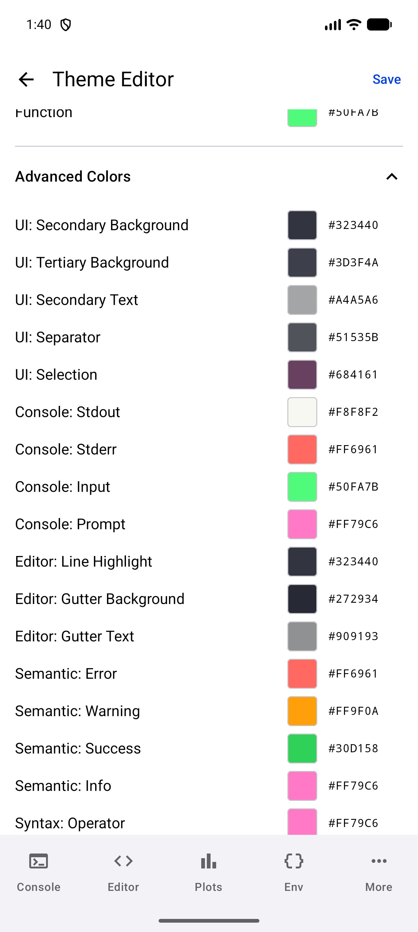
Expand the Advanced Colors section to fine-tune 17 more colors, listed in this order:
- Interface colors: the secondary and tertiary backgrounds, secondary text, separator, and selection
- Console colors: stdout, stderr, input, and prompt
- Editor colors: line highlight, gutter background, and gutter text
- Semantic colors: error, warning, success, and info
- The syntax color for operators
Most of these are automatically derived from your key colors, so you only need to adjust them if you want precise control.
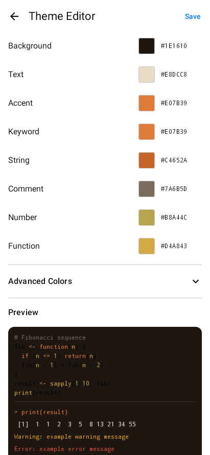
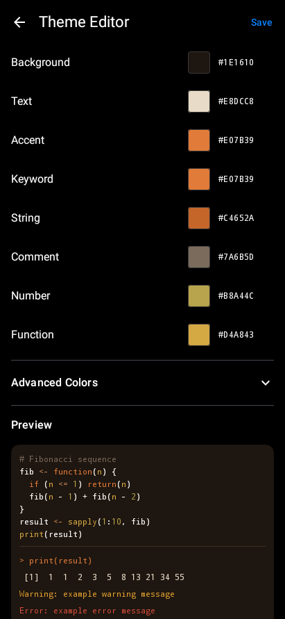
Live Preview
As you change colors, a live preview at the bottom of the editor updates in real time. It shows a sample of syntax-highlighted R code (a Fibonacci function) and console output including prompt, stdout, warning, and error text, so you can see exactly how your theme will look before saving.
Saving Your Theme
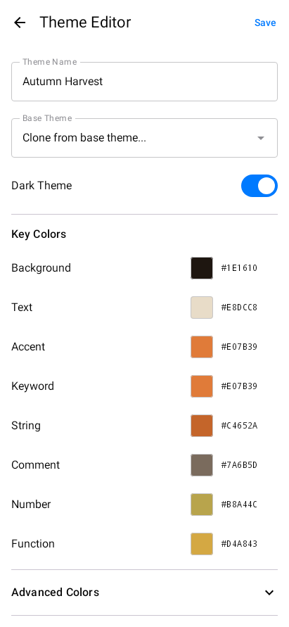
- Enter a name for your theme in the text field at the top
- Set whether the theme is for light or dark mode using the toggle
- Tap Save
Your custom theme appears in the appropriate theme picker (light or dark) and can be selected just like any built-in theme.
Editing and Deleting Custom Themes
Custom themes appear in the Custom Themes section of Settings, each row showing the theme’s name and whether it is light or dark, with two icons at the end: share and delete.
To edit a custom theme, tap the row itself. The Theme Editor opens with all the theme’s colors pre-filled so you can adjust them. There is no separate edit icon.
To delete a custom theme, tap the trash icon on its row. If the deleted theme was your active theme, webRoid falls back to the default theme for that mode.
Built-in themes cannot be edited or deleted. To modify a built-in theme, clone it by selecting it as a base when creating a new custom theme, then adjust the colors.
Importing and Exporting Themes
webRoid can import themes from other editors and share themes with other users.
Importing Themes
webRoid supports three theme file formats:
| Format | Source | File extension |
|---|---|---|
| webRoid native | Themes exported from webRoid or webRios (iOS) | .json |
| VS Code | Export your VS Code color theme as JSON | .json |
| RStudio | RStudio editor themes | .rstheme |
To import a theme:
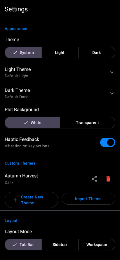
- Open Settings and scroll down to the Custom Themes section
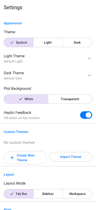
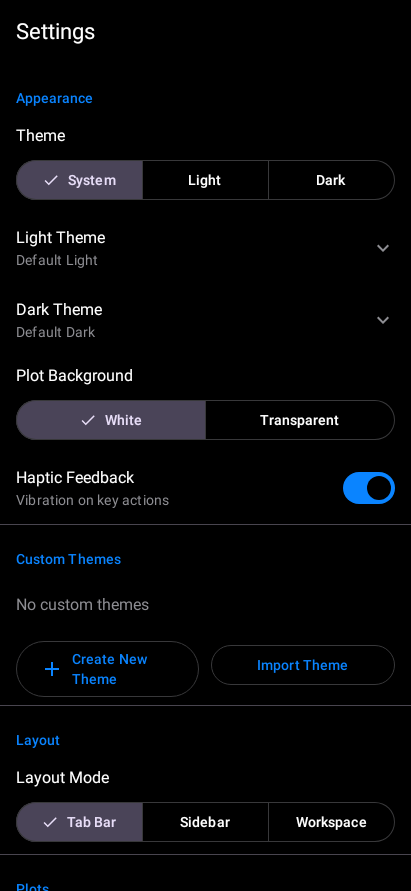
- Tap Import Theme. Android’s file picker opens so you can browse to a
.jsonor.rsthemefile on your device, Downloads folder, or cloud storage (Google Drive, etc.).
The file picker is part of Android, so its appearance varies by device and Android version. Look for the theme file you downloaded or transferred to your device.
Select the theme file. webRoid automatically detects the format and maps colors to its palette. If the imported theme does not define every color, missing values are derived from the colors that are present.
The imported theme appears in the Custom Themes list with its name and a light/dark label.
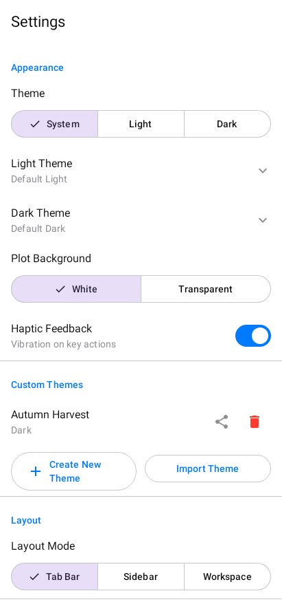
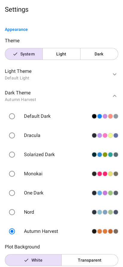
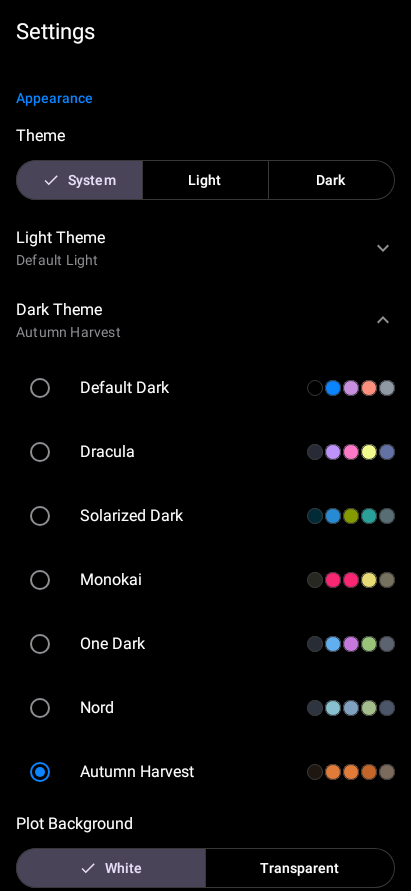
- To activate the imported theme, tap Dark Theme (or Light Theme) to expand the picker. The imported theme appears at the bottom of the list with its color swatches. Tap it to select it.
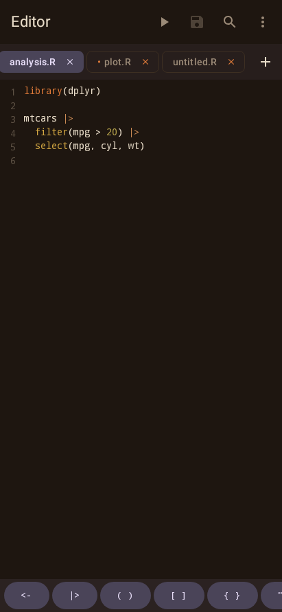
- The theme takes effect immediately. Here is the Console with Autumn Harvest applied:
If you have a favorite VS Code or RStudio theme, you can bring it into webRoid. The mapping handles most themes well, though highly customized themes may need minor adjustments in the Theme Editor after import.
Example Theme Files
To try importing, download one of these example files. Both define the same “Autumn Harvest” palette (warm oranges, reds, and golds on a dark brown background) in different formats.
webRoid native format (download):
{
  "id": "autumn-harvest-example",
  "name": "Autumn Harvest",
  "isDark": true,
  "isBuiltIn": false,
  "palette": {
    "syntax": {
      "keyword": "#E07B39",
      "function": "#D4A843",
      "string": "#C4652A",
      "number": "#B8A44C",
      "comment": "#7A6B5D",
      "operator": "#CC8B55",
      "text": "#E8DCC8"
    },
    "ui": {
      "primaryBackground": "#1E1610",
      "secondaryBackground": "#2A2017",
      "tertiaryBackground": "#362A1E",
      "primaryText": "#E8DCC8",
      "secondaryText": "#9C8B78",
      "accent": "#E07B39",
      "separator": "#3D2F22",
      "selection": "#E07B3933"
    },
    "semantic": {
      "error": "#D94F3B",
      "warning": "#E0A030",
      "success": "#7BAF52",
      "info": "#5A9EC4"
    },
    "console": {
      "stdout": "#E8DCC8",
      "stderr": "#D94F3B",
      "input": "#D4A843",
      "prompt": "#E07B39"
    },
    "editor": {
      "background": "#1E1610",
      "lineHighlight": "#2A2017",
      "gutterBackground": "#171009",
      "gutterText": "#7A6B5D"
    }
  }
}
RStudio format (download):
/* Autumn Harvest - A warm, cozy dark theme with autumn colors */
/* RStudio .rstheme format - import into webRoid or RStudio */

.ace_editor, .rstudio-themes-flat .ace_editor_theme {
  background-color: #1E1610;
  color: #E8DCC8;
}

.ace_cursor {
  color: #E07B39;
}

.ace_gutter {
  background: #171009;
  color: #7A6B5D;
}

.ace_gutter-active-line {
  background-color: #2A2017;
}

.ace_marker-layer .ace_active-line {
  background-color: #2A2017;
}

.ace_marker-layer .ace_selection {
  background: #E07B3933;
}

.ace_keyword {
  color: #E07B39;
}

.ace_function {
  color: #D4A843;
}

.ace_string {
  color: #C4652A;
}

.ace_constant.ace_numeric {
  color: #B8A44C;
}

.ace_comment {
  color: #7A6B5D;
  font-style: italic;
}

.ace_keyword.ace_operator {
  color: #CC8B55;
}

.ace_variable {
  color: #E8DCC8;
}

.ace_support.ace_function {
  color: #D4A843;
}
The native JSON format is a direct serialization of webRoid’s internal theme structure, so every color is preserved exactly. The .rstheme format maps Ace editor CSS selectors to webRoid’s palette; colors not covered by CSS rules (like semantic or console colors) are derived automatically from the colors that are present.
Exporting Themes
To share a custom theme:
- Find it in the Custom Themes list
- Tap the export/share icon
- Choose where to save or share the JSON file
Exported themes use webRoid’s native JSON format and can be imported on another device, shared with other webRoid users, or used in webRios on iOS.
Plot Background
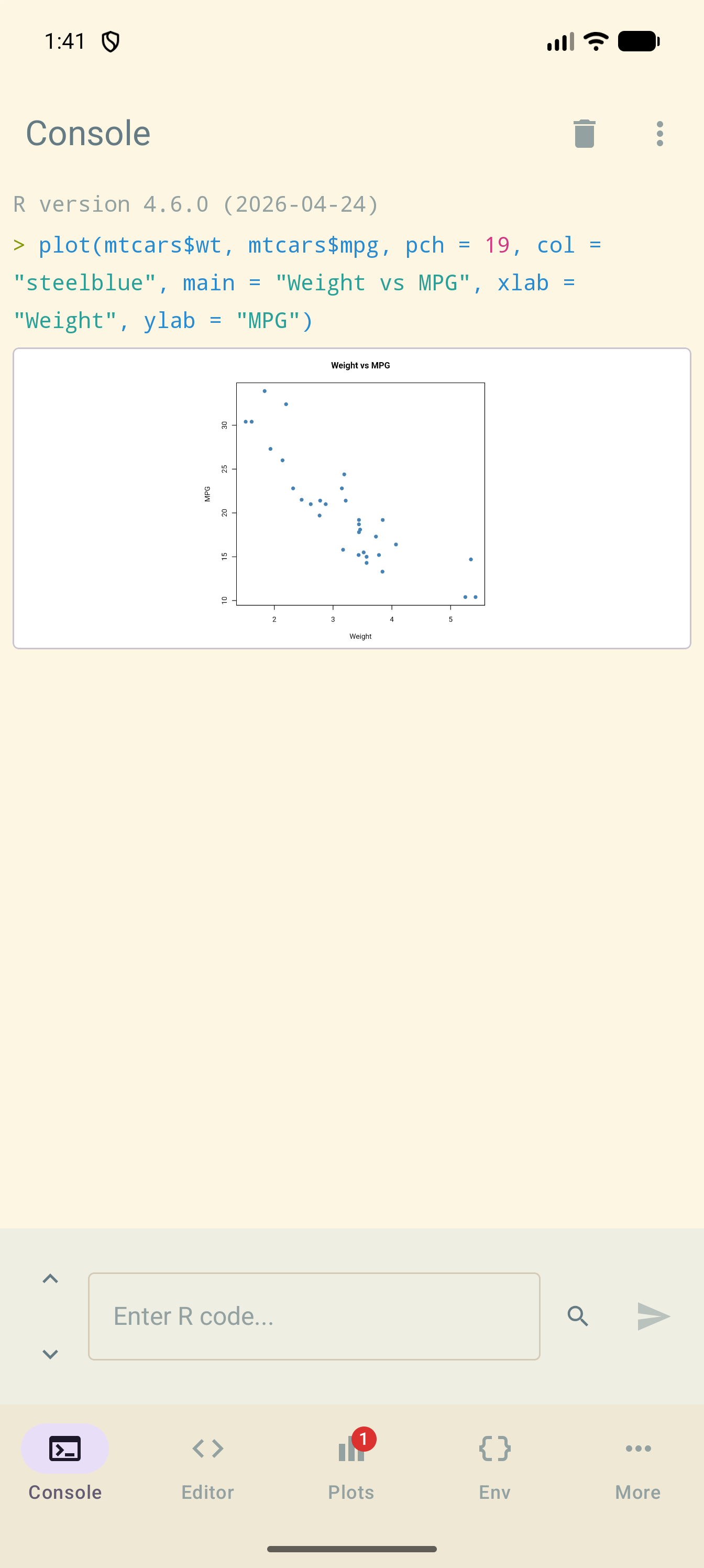
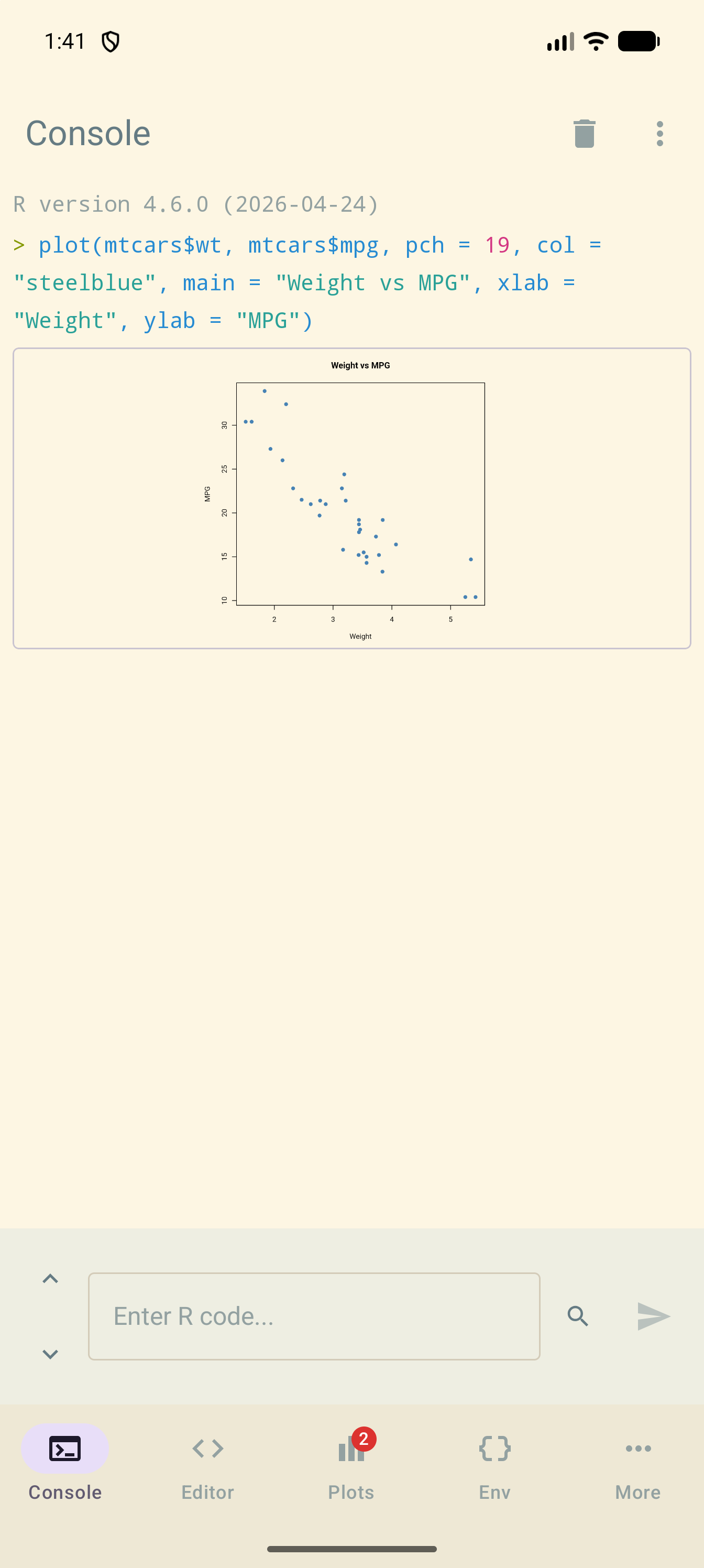
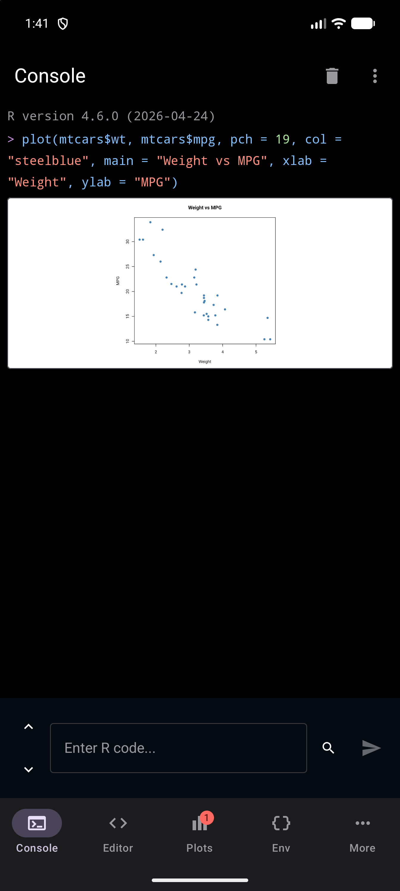
The Plot Background setting (in Settings > Appearance) controls the background color behind R plots:
| Option | Behavior |
|---|---|
| White | Plots always render on a white background, regardless of your theme. This is the default and matches how plots look in desktop R. |
| Transparent | Plots render with a transparent background, allowing your theme’s background color to show through. R draws axes, labels and titles in black unless you choose other colors, so this suits a light theme best: on a dark theme they disappear into the background. |
Here is the same plot drawn inline in the Console, first with White and then with Transparent. The pictures use Solarized Light, or Default Dark if you are reading this page in dark mode:
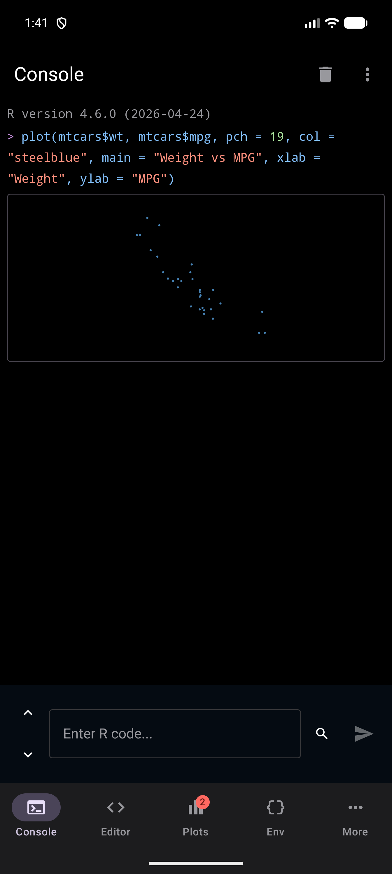
To use Transparent with a dark theme, give the axes and text a light color in the plot call, for example plot(mtcars$wt, mtcars$mpg, main = "Weight vs MPG", fg = "white", col.axis = "white", col.lab = "white", col.main = "white").
The setting is applied when R draws each plot. White plots are drawn on white, and exported PNGs keep that background. Transparent plots have a clear background: in the app your theme shows through, a PNG keeps the transparency, and a JPEG is saved on white because JPEG has no transparency. A plot keeps the background it was drawn with, so run the code again after changing the setting to redraw it.